Border-radius in percentage (%) and pixels (px) or em
Border-radius :
First, you need to understand that the border-radius property takes 2 values. These values are the radii on the X/Y axis of a quarter ellipse defining the shape of the corner.
If only one of the values is set then the second value is equal to the first one. So border-radius: x is equivalent to border-radius:x/x;.
Percentages values
Refering to the W3C specs : CSS Backgrounds and Borders Module Level 3 border-radius property this is what we can read concerning percentage values:
Percentages: Refer to corresponding dimension of the border box.
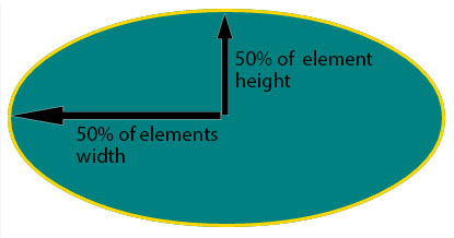
So border-radius:50%; defines the raddi of the ellipse this way :
- the radii on the X axis is 50% of the containers width
- the radii on the Y axis is 50% of the containers height
Pixel and other units
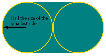
Using one value other than a percentage for border radius (em, in, viewport related units, cm...) will always result in an ellipse with the same X/Y radii. In other words, a circle.
When you set border-radius:999px; the radii of the circle should be 999px. But another rule is applied when the curves overlap reducing the radii of the circle to half the size of the smallest side. So in your example it is equal to half the height of the element : 50px.
For this example (with a fixed size element) you can obtain the same result with both px and percentages. As the element is 230px x 100px, border-radius: 50%; is equivalent to border-radius:115px/50px; (50% of both sides) :
div { display: inline-block; background: teal; width: 230px; height: 100px; padding: 40px 10px; box-sizing: border-box; font-family: courier; font-size: 0.8em; color: #fff;}.percent { border-radius: 50%;}.pixels { border-radius: 115px/50px;}<div class="percent">border-radius:50%;</div><div class="pixels">border-radius:115px/50px;</div>Is it better to specify border-radius in percentages for circle borders?
I prefer to user percentage values because if I change size of my image, I don't need change my border-radius. But in MDN site you can read this bugs about percentage value:
percentage values
- are not supported in older Chrome and Safari versions (it was fixed in Sepember 2010)
- are buggy in Opera prior to 11.50
- are implemented in a non-standard way prior to Gecko 2.0 (Firefox 4). Both horizontal and vertical radii were relative to the width of the border box.
- are not supported in older versions of iOS (prior to 5) and Android versions (prior to WebKit 532)
Check this link for more info: https://developer.mozilla.org/en-US/docs/Web/CSS/border-radius#_values
Border-radius: 50% vs. border-radius: 999em
The border radius property does all it can to mantain same ratio between the overall radius, when you use border-radius: 999em, it keeps the same proportions of the smallest corner.
But when you use border-radius: 50%, it makes the border set to the proportions of the entire object, assuming x-axis for 50% of the width and y-axis for the 50% of the height of the object, all corners combined make it appear as if the object is circular.
Border radius css issue with percent
The possible duplicate comment suggests the problem but does not give any solution.
And using 1em will set border radius equal to the base font-size applied to the element.
I would suggest you to give values of 5-6 ems. In this case it will go till any shortest side reaches 50% and then will become ineffective.
.btn { border: 0; background: #ddd; border-radius: 6em; padding: 8px 12px; margin: 5px;}<button type="button" class="btn">Button 1</button><button type="button" class="btn">Button 2</button><button type="button" class="btn">Button 3</button><button type="button" class="btn">Button 4</button>How do I calculate Pixel based on Percentage for CSS conversion?
As the element is 60px x 60px, border-radius: 50% is equivalent to border-radius: 30px/30px (50% of both sides).
Something like this:
.logo {
   background-color: red;
   width: 60px;
   height: 60px;
   border-radius: 30px/30px;
}
<div class="logo">
</div>Why is the Border-Radius rates changes when the CSS box changes the size
You can define the border-radius in %.
* {
  margin: 1rem;
 }

.box {
  width: 10rem;
  height: 5rem;
  background-color: black;
  border-radius: 15%/30%;
}

.box2 {
  width: 20rem;
  height: 10rem;
  background-color: black;
  border-radius: 15%/30%;
}
<div class="box"></div>
<div class="box2"></div>How to make this shape with border radius?
You could just change the percent to pixels or rem or other units.
See if this fits your requirement - https://codepen.io/alstonchan/pen/eYevKZq.
border-bottom-left-radius: 10rem;
border-bottom-right-radius: 10rem;
/*or*/
border-bottom-left-radius: 160px;
border-bottom-right-radius: 160px;
Changing border-radius when element is in view - how can I change percentage to pixels
Using window.scroll() will negatively impact the performance of your application because it checks for smallest of the movements. What you can do instead is use the Intersection Observer API, like so:
const changeRadiusCallBk = (entries, observer) => {
  const [entry] = entries; //destructuring 0th element into entry variable
  if (entry.isIntersecting)
    document.querySelector('.video_content').classList.add('chg-border-radius');
  else document.querySelector('.video_content').classList.remove('chg-border-radius');
  //If you want to only have the effect once, uncomment below line and comment the above else
  //observer.unobserve(document.querySelector('.video_content'));
};

const observer = new IntersectionObserver(changeRadiusCallBk, {
  root: null,
  //experiment with treshold to see how much of your dom element should be in view before effect kicks in.
  //i.e should it be 50% in view? then use 0.5.
  threshold: 0.5,
  //experiment with the rootMargin positive and negative values or generate it
  //dynamically to see when you want your effect to kick in
  rootMargin: '-10px',
});

observer.observe(document.querySelector('.video_content'));
EDIT:
CSS for smoother Border Radius Transition:
.chg-border-radius{
  border-radius: 10px;
  transition: border-radius 0.6s linear; //play around with this
}
How to create rounded rectangle in css using percentage
To create the button from the image you don't need percentages at all. You can use border-radius: 30px; and it will create even rounding by default. Buttons smaller than 60px in height will divide height in half for example button with height: 40px; will look the same with border-radius: 30px; and border-radius: 20px; and they will behave differently for buttons higher than 40px.
But you can use border-top-left-radius: 10% 100px; to create uneven rounding.
button {
  box-sizing: border-box;

  display: inline-block;
  height: 60px;
  line-height: 60px;
  padding: 0 30px;
  border-radius: 30px;

  border: none;
  background-color: lime;
}
<button>Short</button>
<button>Long button</button>
<button>+</button>Related Topics
Floating Elements Within a Div, Floats Outside of Div. Why
Css Floating Divs At Variable Heights
How to Center Text in Select Box
How to Change Paper Size in Headless Chrome - Print-To-Pdf
How to Set the Size of a Column in a Bootstrap Responsive Table
Child Inside Parent With Min-Height: 100% Not Inheriting Height
How to Change Whole Page Background-Color in Angular
Align Mat-Cards Content (Image, Text and Buttons)
2 Column Div Layout: Right Column With Fixed Width, Left Fluid
Css Change Button Style After Click
Change Button Border Color When the Button Is Being Clicked and After
How to Center ≪Ul≫ ≪Li≫ into a Div
How to Use HTML to Print Header and Footer on Every Printed Page of a Document
Override Body Style for Content in an Iframe