bootstrap breakpoints... need some clarification ' xs sm md lg'
The xs breakpoint actually handles screens from 767 pixels and below. The breakpoint widths are as follows:
- xs= 0-767 pixels
- sm = 768-991 pixels
- md = 992-1199 pixels
- lg = 1200 pixels and up
See http://getbootstrap.com/css/#grid
PLEASE NOTE THIS ANSWER IS FOR VERSION 3.0
What is the difference among col-lg-*, col-md-* and col-sm-* in Bootstrap?
Updated 2020...
Bootstrap 5
In Bootstrap 5 (alpha) there is a new -xxl- size:
col-* - 0 (xs)col-sm-* - 576pxcol-md-* - 768pxcol-lg-* - 992pxcol-xl-* - 1200pxcol-xxl-* - 1400px
Bootstrap 5 Grid Demo
Bootstrap 4
In Bootstrap 4 there is a new -xl- size, see this demo. Also the -xs- infix has been removed, so smallest columns are simply col-1, col-2.. col-12, etc..
col-* - 0 (xs)col-sm-* - 576pxcol-md-* - 768pxcol-lg-* - 992pxcol-xl-* - 1200px
Bootstrap 4 Grid Demo
Additionally, Bootstrap 4 includes new auto-layout columns. These also have responsive breakpoints (col, col-sm, col-md, etc..), but don't have defined % widths. Therefore, the auto-layout columns fill equal width across the row.
Bootstrap 3
The Bootstrap 3 grid comes in 4 tiers (or "breakpoints")...
- Extra small (for smartphones
.col-xs-*) - Small (for tablets
.col-sm-*) - Medium (for laptops
.col-md-*) - Large (for laptops/desktops
.col-lg-*).
These grid sizes enable you to control grid behavior on different widths. The different tiers are controlled by CSS media queries.
So in Bootstrap's 12-column grid...
col-sm-3 is 3 of 12 columns wide (25%) on a typical small device width (> 768 pixels)
col-md-3 is 3 of 12 columns wide (25%) on a typical medium device width (> 992 pixels)
The smaller tier (xs, sm or md) also defines the size for larger screen widths. So, for the same size column on all tiers, just set the width for the smallest viewport...
<div class="col-lg-3 col-md-3 col-sm-3">..</div> is the same as,
<div class="col-sm-3">..</div>
Larger tiers are implied. Because col-sm-3 means 3 units on sm-and-up, unless specifically overridden by a larger tier that uses a different size.
xs(default) > overridden by sm > overridden by md > overridden by lg
Combine the classes to use change column widths on different grid sizes. This creates a responsive layout.
<div class="col-md-3 col-sm-6">..</div>
The sm, md and lg grids will all "stack" vertically on screens/viewports less than 768 pixels. This is where the xs grid fits in. Columns that use the col-xs-* classes will not stack vertically, and continue to scale down on the smallest screens.
Resize your browser using this demo and you'll see the grid scaling effects.
This article explains more about how the Bootstrap grid
bootstrap 3.3.7 xs breakpoint doesn't work
By default, Bootstrap 3.3's .col-xs classes apply to screen widths under 768px:
Note that you're missing a closing </div> before your </body>, which may be interfering with your display. You can prevent these syntax errors by validating your markup with the W3C Validation Service.
You also need to make sure that your JavaScript is inside either your <head> or <body> tags, and that you have included jQuery (which Bootstrap's JavaScript depends on). Neither of these will affect your stacking, however.
Here's a complete, working example:
<!DOCTYPE html><html>
<head>  <meta charset="utf-8">  <title>My Test File</title>  <!-- Latest compiled and minified CSS -->  <link rel="stylesheet" href="https://maxcdn.bootstrapcdn.com/bootstrap/3.3.7/css/bootstrap.min.css"></head>
<body>  <div class="container-fluid">    <div class="row">      <div class="col-xs-12 col-sm-6 col-md-3 col-lg-3" style="background:red">        column-1      </div>      <div class="col-xs-12 col-sm-6 col-md-3 col-lg-3" style="background:yellow">        column-2      </div>      <div class="col-xs-12 col-sm-6 col-md-3 col-lg-3" style="background:orange">        column-3      </div>      <div class="col-xs-12 col-sm-6 col-md-3 col-lg-3" style="background:aqua">        column-4      </div>    </div>  </div>
  <!-- Latest compiled and minified JavaScript -->  <script src="https://ajax.googleapis.com/ajax/libs/jquery/2.1.1/jquery.min.js"></script>  <script src="https://maxcdn.bootstrapcdn.com/bootstrap/3.3.7/js/bootstrap.min.js"></script>
</body>
</html>
Bootstrap breakpoints not working properly in the chrome inspector?
It turns out I was looking at the breakpoints for Bootstrap v4+ when I have been using version 3.3.7.
For Bootstrap 4 all of the breakpoints were shifted to make room for col-xl-*.
The Bootstrap 3 breakpoints are:
/* Extra Small Devices, Phones */
    @media only screen and (min-width : 480px) {

}

/* Small Devices, Tablets */
@media only screen and (min-width : 768px) {

}

/* Medium Devices, Desktops */
@media only screen and (min-width : 992px) {

}

/* Large Devices, Wide Screens */
@media only screen and (min-width : 1200px) {

}
Customize Bootstrap 4's grid-system Breakpoints
Bootstrap 4.x & 5.x
You need to override the $grid-breakpoints and $container-max-widths variables BEFORE importing the Bootstrap sources. Here a working example (scss):
// File: theme.scss
// Override default BT variables:
$grid-breakpoints: (
        xs: 0,
        sm: 576px,
        md: 768px,
        lg: 992px,
        xl: 1200px,
        xxl: 1900px
);

$container-max-widths: (
        sm: 540px,
        md: 720px,
        lg: 960px,
        xl: 1140px,
        xxl: 1610px
);

// Import BT sources
@import "../node_modules/bootstrap/scss/bootstrap";

// Your CSS (SASS) rules here...
What is the meaning of xs, md, lg in CSS Flexbox system?
Let us assume that our screen is divided into 12 columns.
The xs part takes up when screen is extra small, Similarly small, medium and large classes as well, based on their respective screen size definition in CSS.
The example you provided:
<Row>
  <Col xs={12} sm={3} md={2} lg={1} />
  <Col xs={6} sm={6} md={8} lg={10} />
  <Col xs={6} sm={3} md={2} lg={1} />
</Row>
For our sake lets assume these three columns are named as col-1, col-2 and col-3
On an extra small screen:
col-1 takes up all the 12 columns and the rest two of them take 6 each(on a new row)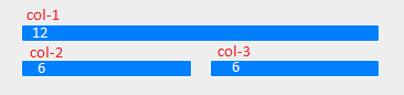
On small screens
col-1 and col-3 takes up 3, while the middle one col-2 takes 6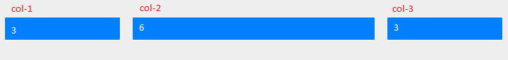
Similarly
Medium screens
Large screens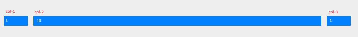
P.S. Images are screenshots of the link you provided (by resizing the browser for each screen size)
css for bootstrap 3 for screens smaller than 767 xs
One option mentioned in Bootstrap's docs is to change what the boundary between the extra-small (xs) and small (sm) screen sizes is by simply changing the value of the @screen-sm-min LESS variable (which lives in Bootstrap's variables.less file) and then recompiling Bootstrap's CSS.
Meaning of numbers in col-md-4, col-xs-1, col-lg-2 in Bootstrap
Applies to Bootstrap 3 only.
Ignoring the letters (xs, sm, md, lg) for now, I'll start with just the numbers...
- the numbers (1-12) represent a portion of the total width of any div
- all divs are divided into 12 columns
- so,
col-*-6spans 6 of 12 columns (half the width),col-*-12spans 12 of 12 columns (the entire width), etc
So, if you want two equal columns to span a div, write
<div class="col-xs-6">Column 1</div>
<div class="col-xs-6">Column 2</div>
Or, if you want three unequal columns to span that same width, you could write:
<div class="col-xs-2">Column 1</div>
<div class="col-xs-6">Column 2</div>
<div class="col-xs-4">Column 3</div>
You'll notice the # of columns always add up to 12. It can be less than twelve, but beware if more than 12, as your offending divs will bump down to the next row (not .row, which is another story altogether).
You can also nest columns within columns, (best with a .row wrapper around them) such as:
<div class="col-xs-6">
  <div class="row">
    <div class="col-xs-4">Column 1-a</div>
    <div class="col-xs-8">Column 1-b</div>
  </div>
</div>
<div class="col-xs-6">
  <div class="row">
    <div class="col-xs-2">Column 2-a</div>
    <div class="col-xs-10">Column 2-b</div>
  </div>
</div>
Each set of nested divs also span up to 12 columns of their parent div. NOTE: Since each .col class has 15px padding on either side, you should usually wrap nested columns in a .row, which has -15px margins. This avoids duplicating the padding and keeps the content lined up between nested and non-nested col classes.
-- You didn't specifically ask about the xs, sm, md, lg usage, but they go hand-in-hand so I can't help but touch on it...
In short, they are used to define at which screen size that class should apply:
- xs = extra small screens (mobile phones)
- sm = small screens (tablets)
- md = medium screens (some desktops)
- lg = large screens (remaining desktops)
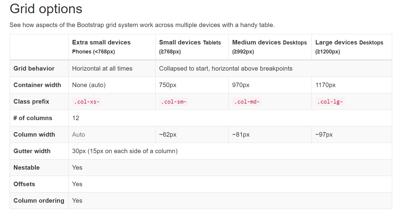
Read the "Grid
Options"
chapter from the official Bootstrap documentation for more details.
You should usually classify a div using multiple column classes so it behaves differently depending on the screen size (this is the heart of what makes bootstrap responsive). eg: a div with classes col-xs-6 and col-sm-4 will span half the screen on the mobile phone (xs) and 1/3 of the screen on tablets(sm).
<div class="col-xs-6 col-sm-4">Column 1</div> <!-- 1/2 width on mobile, 1/3 screen on tablet) -->
<div class="col-xs-6 col-sm-8">Column 2</div> <!-- 1/2 width on mobile, 2/3 width on tablet -->
NOTE: as per comment below, grid classes for a given screen size apply to that screen size and larger unless another declaration overrides it (i.e. col-xs-6 col-md-4 spans 6 columns on xs and sm, and 4 columns on md and lg, even though sm and lg were never explicitly declared)
NOTE: if you don't define xs, it will default to col-xs-12 (i.e. col-sm-6 is half the width on sm, md and lg screens, but full-width on xs screens).
NOTE: it's actually totally fine if your .row includes more than 12 cols, as long as you are aware of how they will react. --This is a contentious issue, and not everyone agrees.
Bootstrap Container Fluid for xs, sm
Update 2020:
As of Bootstrap 4.4, there are now responsive containers:
<div class="container-sm">100% wide until small breakpoint</div>
<div class="container-md">100% wide until medium breakpoint</div>
<div class="container-lg">100% wide until large breakpoint</div>
<div class="container-xl">100% wide until extra large breakpoint</div>
Demo
Original answer:
The container and container-fluid are identical on the xs breakpoint since they're both full width. To override the width for the sm breakpoint you could do this..
@media (max-width: 992px) {
   .container {
      width: 100%;
   }
}
Demo
Related Topics
How to Add Shimmer Effect in CSS
D3Js Svg Open Lines Display a Fill Artifact, How to Fix It
CSS Not Loading in Firefox, Opera and Ie - Chrome and Safari Works Just Fine
†Appearing Instead of Quotation Marks
Question About CSS Files for Smartgwt Project
How to Draw Vertical Separators in The Interior Gaps of a CSS Grid of Varying Columns
How to Target The Last Column in a CSS Grid
CSS Deprecate Single Class When There Are 2 Classes
Building CSS with Tailwindcss Not Working
Why Is My Bootstrap Column Centered Instead of Left-Aligned
Understanding Margin-Collpasing
Grid Layout: Create CSS So Elements Keep Position When Adjacent Element Gets Resized
Card Back Hidden on First Transition in Chrome
Bootstrap 3 - Change Dropdown Background Colour