Bootstrap: align input with button
Twitter Bootstrap 4
In Twitter Bootstrap 4, inputs and buttons can be aligned using the input-group-prepend and input-group-append classes (see https://getbootstrap.com/docs/4.0/components/input-group/#button-addons)
Group button on the left side (prepend)
<div class="input-group mb-3">
  <div class="input-group-prepend">
    <button class="btn btn-outline-secondary" type="button">Button</button>
  </div>
  <input type="text" class="form-control">
</div>
Group button on the right side (append)
<div class="input-group mb-3">
  <input type="text" class="form-control">
  <div class="input-group-append">
    <button class="btn btn-outline-secondary" type="button">Button</button>
  </div>
</div>
Twitter Bootstrap 3
As shown in the answer by @abimelex, inputs and buttons can be aligned by using the .input-group classes (see http://getbootstrap.com/components/#input-groups-buttons)
Group button on the left side
<div class="input-group">
  <span class="input-group-btn">
    <button class="btn btn-default" type="button">Go!</button>
  </span>
  <input type="text" class="form-control">
</div>
Group button on the right side
<div class="input-group">
   <input type="text" class="form-control">
   <span class="input-group-btn">
        <button class="btn btn-default" type="button">Go!</button>
   </span>
</div>
This solution has been added to keep my answer up to date, but please stick your up-vote on the answer provided by @abimelex.
Twitter Bootstrap 2
Bootstrap offers an .input-append class, which works as a wrapper element and corrects this for you:
<div class="input-append">
    <input name="search" id="search"/>
    <button class="btn">button</button>
</div>
As pointed out by @OleksiyKhilkevich in his answer, there is a second way to align input and button by using the .form-horizontal class:
<div class="form-horizontal">
    <input name="search" id="search"/>
    <button class="btn">button</button>
</div>
The Differences
The difference between these two classes is that .input-append will place the button up against the input element (so they look like they are attached), where .form-horizontal will place a space between them.
-- Note --
To allow the input and button elements to be next to each other without spacing, the font-size has been set to 0 in the .input-append class (this removes the white spacing between the inline-block elements). This may have an adverse effect on font-sizes in the input element if you want to override the defaults using em or % measurements.
bootstrap: how align a input with a button
Adding this for the .input-group-btn gives this:
.input-group-btn {display: block;}
Preview
Snippet
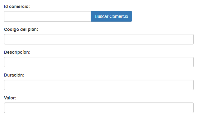
.modal .input-group-btn {display: block;}<link href="https://maxcdn.bootstrapcdn.com/bootstrap/3.3.7/css/bootstrap.min.css" rel="stylesheet" /><div class="modal show"> <div class="modal-body"> <form> <div class="form-group"> <div class="input-group"> <label for="nombre_comercio_form">Id comercio:</label> <input type="text" class="form-control" id="nombre_comercio_form" ng-model="nombre_comercio"> <span class="input-group-btn"> <button type="button" class="btn btn-primary" onclick="$('#buscadora').focus()" data- toggle="modal" data-target="#ModalBuscarComercio">Buscar Comercio </button> </span> </div> </div> <div class="form-group"> <label for="nit_form">Codigo del plan:</label> <input type="text" class="form-control" id="nit_form" ng-model="nit_comercio"> </div> <div class="form-group"> <label for="nombre_payu_form">Descripcíon:</label> <input type="text" class="form-control" id="nombre_payu_form" ng-mode="nombre_payu"> </div> <div class="form-group"> <label for="correo_payu_form">Duración:</label> <input type="text" class="form-control" id="correo_payu_form" ng-model="correo_payu"> </div> <div class="form-group"> <label for="plan_code_form">Valor:</label> <input type="text" class="form-control" id="plan_code_form" ng-model="plan_code"> </div> </form> </div></div>Align button with input forms with labels
Instead of an improper label, use the align-self-end class (bootstrap 4 / flexbox) to vertically align the button to the bottom of the column.
<div class="form-group col-md-2 align-self-end">
  <button class="btn btn-primary" id="btn" name="btn" type="submit">Submit</button>
</div>
How to put button next to input Twitter Bootstrap 4?
Option 1 - form-inline class...
<div class="form-inline">
    <input class="form-control">
    <button class="btn btn-primary">enter</button>
</div>
Also, you can use mr-1 (margin-right) to add a small margin between the input and the button: https://www.codeply.com/go/5XCUJIEvua
Option 2 - table-cell class...
Another option (if you want the input and button to be full width) is to use d-table-cell class..
<div class="d-table-cell w-100">
    <input class="form-control">
</div>
 <div class="d-table-cell align-middle">
    <button class="btn btn-primary">enter</button>
</div>
Option 3 - d-flex class...
Finally, the easiest way may be to simply use d-flex which sets display:flex
<div class="d-flex">
        <input class="form-control mr-1">
        <button class="btn btn-primary">enter</button>
</div>
Demo of all 3 options:
https://www.codeply.com/go/5XCUJIEvua
Bootstrap, align input with label to button without label, vertical form / not horizontal
Bootstrap is a great structure in which you can create any kind of html just you need to understand the structure. Always try to use only bootstrap classes but not the external things.
Check this bootstrap only structure with the desired output
<div class='container' style='width:200px; margin: 50px;'>
  <div class="row">
    <div class="col-lg-12">
      <label>Name</label>
      <div class="row">
        <div class="col-xs-10">
          <div class="form-group">
            <input type="text" class="form-control" />
          </div>
        </div>
        <div class="col-xs-2">
          <div class="form-group">
            <div class="btn btn-danger">Remove</div>
          </div>
        </div>
      </div>
    </div>
  </div>
</div>
Example : https://jsfiddle.net/r6o5hysk/2/
Bootstrap input button not aligning with other fields
Where you have
<div class="form-group">
    <input type="submit" name="commit" value="Filter" class="btn btn-default btn btn-primary form-control" />
</div>
replace by
<div class="form-group">
    <input type="submit" name="commit" value="Filter" class="btn-primary form-control" />
</div>
there's no need to call the classes multiple times and in this case, the .btn is causing your issue
Tested on your fiddle, works like a charm ;)
Bootstrap: How to place button next to input-group
You could also try the pull-left class.
The classes .pull-left and .pull-right also exist and were previously
used as part of the media component, but are deprecated for that use
as of v3.3.0. They are approximately equivalent to .media-left and
.media-right, except that .media-right should be placed after the
.media-body in the html.
The html:
<div>
    <div class="pull-left">
        <button type="button" class="btn">Delete</button>
    </div>
    <div>
        <div class="input-group">
            <input type="text" class="form-control" value="1" />
            <span class="input-group-addon">Update</span>
        </div>
    </div>
</div>
You can use:
style="margin-right:5px"
to add some spacing after the div, and then the new mark-up would be as follows:
<div>
    <div class="pull-left" style="margin-right:5px">
        <button type="button" class="btn">Delete</button>
    </div>
    <div>
        <div class="input-group">
            <input type="text" class="form-control" value="1" />
            <span class="input-group-addon">Update</span>
        </div>
    </div>
</div>
Bootstrap input group and button alignment
<div class="row">
    <div class="col-lg-6">
        <div class="input-group">
          <input type="text" class="form-control" placeholder="Search by a substring in good's name..">
          <span class="input-group-btn">
            <button class="btn btn-default" type="button" onclick="filter()">Search</button>
          </span>
        </div>
  </div>

        <div class="col-lg-6">
          <button class="btn btn-default" type="button" onclick="addNew()">Add new</button>
        </div>
      </div>
Separete the col-lg-6 and input-group from the div
Bootply : http://www.bootply.com/W8ao9A0a4r
How to align a Bootstrap form's input fields and labels?
You can do something like this:
<meta charset="UTF-8"><meta name="viewport" content="width=device-width, initial-scale=1.0"><link rel="stylesheet" type="text/css" href="https://stackpath.bootstrapcdn.com/bootstrap/4.2.1/css/bootstrap.min.css"><link rel="stylesheet" type="text/css" href="https://cdnjs.cloudflare.com/ajax/libs/font-awesome/4.7.0/css/font-awesome.css">
<style>    .container {        margin: 5px auto;        padding: 5px;        color: #17A2B8;        font-family: Verdana, Geneva, sans-serif;    }    h1 {        text-align: center;    }    .btn, .btn-outline-secondary {        border-color: #17A2B8;        background-color: #17A2B8;        color: #ffffff;    }    .btn:hover, .btn-outline-secondary:hover {        background-color: #ffffff;        color: #17A2B8;        border-color: #17A2B8;    }    .show > .btn-outline-secondary.dropdown-toggle {        color: #ffffff;        background-color: #17A2B8;        border-color: #17A2B8;    }</style>
<div class="container">    <h1>Form</h1>    <form>        <div class="form-row">            <div class="form-group col-xs-12 col-sm-12 col-md-12 col-lg-6">                <label for="companyId">Company ID</label>                <input type="text" class="form-control" id="companyId">            </div>            <div class="form-group col-xs-12 col-sm-12 col-md-12 col-lg-6">                <label for="companyName">Company Name</label>                <input type="text" class="form-control" id="companyName">            </div>        </div>        <hr>        <div class="form-row">            <div class="form-group col-xs-6 col-sm-6 col-md-6 col-lg-3">                <label for="itemCode">Item Code</label>                <div class="input-group">                    <input type="text" class="form-control" aria-label="Text input with dropdown button">                    <div class="input-group-append">                        <button class="btn btn-outline-secondary dropdown-toggle" type="button" data-toggle="dropdown" aria-haspopup="true" aria-expanded="false"></button>                        <div class="dropdown-menu dropdown-menu-right">                            <a class="dropdown-item" href="#">Item Code 1</a>                            <a class="dropdown-item" href="#">Item Code 2</a>                            <a class="dropdown-item" href="#">Item Code 3</a>                        </div>                    </div>                </div>            </div>            <div class="form-group col-xs-6 col-sm-6 col-md-6 col-lg-3">                <label for="itemName">Item Name</label>                <input type="text" class="form-control" id="itemName">            </div>            <div class="form-group col-xs-6 col-sm-6 col-md-6 col-lg-3">                <label for="brandCode">Brand Code</label>                <div class="input-group">                    <input type="text" class="form-control" aria-label="Text input with dropdown button">                    <div class="input-group-append">                        <button class="btn btn-outline-secondary dropdown-toggle" type="button" data-toggle="dropdown" aria-haspopup="true" aria-expanded="false"></button>                        <div class="dropdown-menu dropdown-menu-right">                            <a class="dropdown-item" href="#">Brand Code 1</a>                            <a class="dropdown-item" href="#">Brand Code 2</a>                            <a class="dropdown-item" href="#">Brand Code 3</a>                        </div>                    </div>                </div>            </div>            <div class="form-group col-xs-6 col-sm-6 col-md-6 col-lg-3">                <label for="brandName">Brand Name</label>                <input type="text" class="form-control" id="brandName">            </div>        </div>        <div class="form-row">            <div class="form-group col-xs-6 col-sm-6 col-md-6 col-lg-3">                <label for="categoryCode">Category Code</label>                <div class="input-group">                    <input type="text" class="form-control" aria-label="Text input with dropdown button">                    <div class="input-group-append">                        <button class="btn btn-outline-secondary dropdown-toggle" type="button" data-toggle="dropdown" aria-haspopup="true" aria-expanded="false"></button>                        <div class="dropdown-menu dropdown-menu-right">                            <a class="dropdown-item" href="#">Category Code 1</a>                            <a class="dropdown-item" href="#">Category Code 2</a>                            <a class="dropdown-item" href="#">Category Code 3</a>                        </div>                    </div>                </div>            </div>            <div class="form-group col-xs-6 col-sm-6 col-md-6 col-lg-3">                <label for="categoryName">Category Name</label>                <input type="text" class="form-control" id="categoryName">            </div>            <div class="form-group col-xs-6 col-sm-6 col-md-6 col-lg-3">                <label for="subCategoryCode">Sub Category Code</label>                <div class="input-group">                    <input type="text" class="form-control" aria-label="Text input with dropdown button">                    <div class="input-group-append">                        <button class="btn btn-outline-secondary dropdown-toggle" type="button" data-toggle="dropdown" aria-haspopup="true" aria-expanded="false"></button>                        <div class="dropdown-menu dropdown-menu-right">                            <a class="dropdown-item" href="#">Sub Category Code 1</a>                            <a class="dropdown-item" href="#">Sub Category Code 2</a>                            <a class="dropdown-item" href="#">Sub Category Code 3</a>                        </div>                    </div>                </div>            </div>            <div class="form-group col-xs-6 col-sm-6 col-md-6 col-lg-3">                <label for="subCategoryName">Sub Category Name</label>                <input type="text" class="form-control" id="subCategoryName">            </div>        </div>        <div class="form-row">            <div class="form-group col-xs-6 col-sm-6 col-md-6 col-lg-3">                <label for="unitCode">Unit Code</label>                <div class="input-group">                    <input type="text" class="form-control" aria-label="Text input with dropdown button">                    <div class="input-group-append">                        <button class="btn btn-outline-secondary dropdown-toggle" type="button" data-toggle="dropdown" aria-haspopup="true" aria-expanded="false"></button>                        <div class="dropdown-menu dropdown-menu-right">                            <a class="dropdown-item" href="#">Unit Code 1</a>                            <a class="dropdown-item" href="#">Unit Code 2</a>                            <a class="dropdown-item" href="#">Unit Code 3</a>                        </div>                    </div>                </div>            </div>            <div class="form-group col-xs-6 col-sm-6 col-md-6 col-lg-3">                <label for="unitName">Unit Name</label>                <input type="text" class="form-control" id="unitName">            </div>            <div class="form-group col-xs-6 col-sm-6 col-md-6 col-lg-3">                <label for="supplierCode">Supplier Code</label>                <div class="input-group">                    <input type="text" class="form-control" aria-label="Text input with dropdown button">                    <div class="input-group-append">                        <button class="btn btn-outline-secondary dropdown-toggle" type="button" data-toggle="dropdown" aria-haspopup="true" aria-expanded="false"></button>                        <div class="dropdown-menu dropdown-menu-right">                            <a class="dropdown-item" href="#">Supplier Code 1</a>                            <a class="dropdown-item" href="#">Supplier Code 2</a>                            <a class="dropdown-item" href="#">Supplier Code 3</a>                        </div>                    </div>                </div>            </div>            <div class="form-group col-xs-6 col-sm-6 col-md-6 col-lg-3">                <label for="supplierName">Supplier Name</label>                <input type="text" class="form-control" id="supplierName">            </div>        </div>        <div class="form-row">            <div class="form-group col-xs-6 col-sm-6 col-md-6 col-lg-3">                <label for="gstCode">GST Code</label>                <div class="input-group">                    <input type="text" class="form-control" aria-label="Text input with dropdown button">                    <div class="input-group-append">                        <button class="btn btn-outline-secondary dropdown-toggle" type="button" data-toggle="dropdown" aria-haspopup="true" aria-expanded="false"></button>                        <div class="dropdown-menu dropdown-menu-right">                            <a class="dropdown-item" href="#">GST Code 1</a>                            <a class="dropdown-item" href="#">GST Code 2</a>                            <a class="dropdown-item" href="#">GST Code 3</a>                        </div>                    </div>                </div>            </div>            <div class="form-group col-xs-6 col-sm-6 col-md-6 col-lg-3">                <label for="gstPercentage">GST Percentage</label>                <input type="text" class="form-control" id="gstPercentage">            </div>            <div class="form-group col-xs-6 col-sm-6 col-md-6 col-lg-3">                <label for="sgstPercentage">SGST Percentage</label>                <input type="text" class="form-control" id="sgstPercentage">            </div>            <div class="form-group col-xs-6 col-sm-6 col-md-6 col-lg-3">                <label for="cgstPercentage">CGST Percentage</label>                <input type="text" class="form-control" id="cgstPercentage">            </div>        </div>        <div class="form-row">            <div class="form-group col-xs-6 col-sm-6 col-md-6 col-lg-3">                <label for="costPrice">Cost Price</label>                <input type="text" class="form-control" id="costPrice">            </div>            <div class="form-group col-xs-6 col-sm-6 col-md-6 col-lg-3">                <label for="sellingPrice">Selling Price</label>                <input type="text" class="form-control" id="sellingPrice">            </div>            <div class="form-group col-xs-6 col-sm-6 col-md-6 col-lg-3">                <label for="mrp">MRP</label>                <input type="text" class="form-control" id="mrp">            </div>            <div class="form-group col-xs-6 col-sm-6 col-md-6 col-lg-3">                <label for="boxWeight">Box Weight</label>                <input type="text" class="form-control" id="boxWeight">            </div>        </div>        <hr>        <div class="col-auto my-1">            <button type="submit" class="btn"><i class="fa fa-save"></i> Save</button>            <button type="submit" class="btn"><i class="fa fa-eraser"></i> Clear</button>            <button type="submit" class="btn"><i class="fa fa-window-close"></i> Close</button>        </div>        <hr>    </form></div>
<script type="text/javascript" src="https://code.jquery.com/jquery-3.3.1.slim.min.js"></script><script type="text/javascript" src="https://cdnjs.cloudflare.com/ajax/libs/popper.js/1.14.6/umd/popper.min.js"></script><script type="text/javascript" src="https://stackpath.bootstrapcdn.com/bootstrap/4.2.1/js/bootstrap.min.js"></script>
Related Topics
Replace Input Type=File by an Image
Css: Using Raw Svg in the Url Parameter of a Background-Image in Ie
How to Make a Fieldset Legend-Style "Background Line" on Heading Text
Why Put in Front of the File Name "_" or "_" in SCSS/Css
Css: Are View Height (Vh) and View Width (Vw) Units Widely Supported
Sass Indented Syntax on Multiple Lines
How Do Browsers Read and Interpret CSS
In CSS, Differencebetween Cascading and Inheritance
3 Columns, Center Column Fixed, Sides Fill Parents
What Does .Container.\31 25\25 Mean in CSS
How to Add Animated Gradient to an Svg Path
How to Remove the Gloss on a Select Element in Safari on MAC
Selenium Webdriver Get Text from CSS Property "Content" on a ::Before Pseudo Element
Custom Cursor Image Doesn't Work in All Ies