As we all know, CSS is powerful. But if you only use CSS, can you achieve the following responsive layout effect.
1. When the screen viewport is wider, it is displayed as an overall Table style.
2. When the screen viewport width is small, each row of data in the original Table is split into a Table for display.
It's an interesting responsive layout that gives information a nice display on small screens. So, is it possible to achieve such a layout using only CSS? The answer is yes.
First, it's not hard to see that media queries will definitely be used. In addition, we observe that each group of data after splitting will have a group of header information that was originally a Table as a whole. The main difficulty is here. How can we display this header information at the same time when we split it into sub-tables one by one for display?
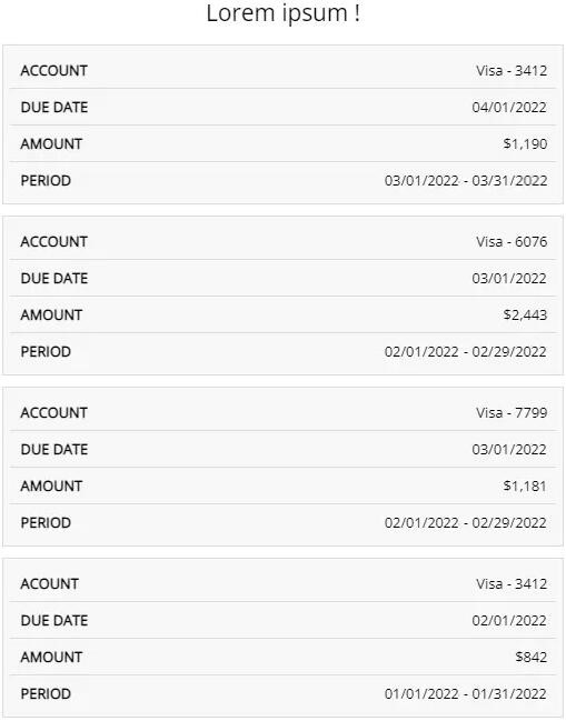
Table Responsive Layout Tips
1. Implementation of the basic structure
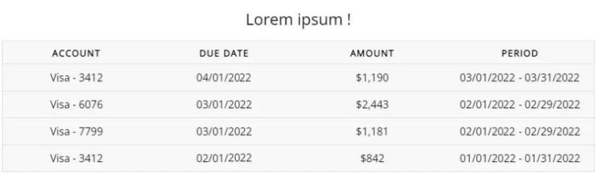
First, let's implement HTML and corresponding CSS for regular widescreen. Simpler, nothing special here. You can use <table> tags or use div, ul, and other tags to simulate a table.
<table>
  <caption>Lorem ipsum !</caption>
  <thead>
    <tr>
      <th>Account</th>
      <th>Due Date</th>
      <th>Amount</th>
      <th>Period</th>
    </tr>
  </thead>
  <tbody>
    <tr>
      <td >="Account">Visa - 3412</td>
      <td >="Due Date">04/01/2022</td>
      <td >="Amount">$1,190</td>
      <td >="Period">03/01/2022 - 03/31/2022</td>
    </tr>
    // ... repeat multiple groups
  </tbody>
</table>
You will get such a simple Table.
2. Use media queries to split a single Table into multiple
The next step is also simple. Set an appropriate threshold (depending on the actual business situation), and use media queries to split a single table into multiple sub-tables.
@media screen and (max-width: 600px) {
  table {
    border: 0;
  }
  table thead {
    display: none;
  }
  table tr {
    display: block;
    margin-bottom: 10px;
  }
  table td {
    border-bottom: 1px solid #ddd;
    display: block;
  }
}
The specific thing to do is also very simple:
1. Using media queries, set the style of the screen width to less than 600px.
2. Remove the header of the original form and hide it directly.
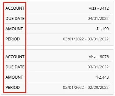
3. Set the original line of <tr> to display: block, and set a bottom margin to separate each one. Well, when the screen width is less than 600px, we get such a Table. The next step is the most crucial step. How do we display the original header information in each row (in <td>) of the sub-table? It is actually very simple here, just simply using pseudo-elements, which is an extremely small feature implementation that can read HTML tag attributes. We just need to simply modify the code to give the HTML of each <td> with the corresponding header column description information. Then, with the help of the pseudo-element of td, the display of the header information can be realized. Here, our core knowledge point is the knowledge point that the pseudo-element of the element can read the attribute content in its HTML element in the content attribute and display it. Suppose an HTML tag is defined as <div>, then the pseudo-element corresponding to the div is set with content: attr(>content:"ABC"). In this way, we get the following effect under the small screen. This feature of pseudo-elements can actually be applied in many places in daily use. Have you learned this little trick? Hope this article is helpful to you.<td>
display: block
<tr>

3. Realize the display of header information with the help of pseudo-elements and extreme characteristics
<table>
  // The above information is consistent
  <tbody>
    <tr>
      <td >="Account">Visa - 3412</td>
      <td >="Due Date">04/01/2022</td>
      <td >="Amount">$1,190</td>
      <td >="Period">03/01/2022 - 03/31/2022</td>
    </tr>
    <tr>
      <td scope="row" >="Account">Visa - 6076</td>
      <td >="Due Date">03/01/2022</td>
      <td >="Amount">$2,443</td>
      <td >="Period">02/01/2022 - 02/29/2022</td>
    </tr>
    // ... do the same for each tr
  </tbody>
</table>
@media screen and (max-width: 600px) {
  // ... be consistent
  table td {
    position: relative;
    display: block;
    text-align: right;
  }
  table td::before {
    position: absolute;
    left: 10px;
    righht: 0;
    content: attr(data-label);
  }
}