How to implement the border gradient effect in CSS? You can directly use border-image to achieve the border gradient effect. Let's see how to do it.
border-image property
The border-image property is a shorthand property that uses an image to create a border. The syntax for using this property is shown below.
border-image: source slice width outset repeat|initial|inherit;
Parameters
border-image-source: Used to specify the location of the image to be used to draw the border.
border-image-slice: The image border is offset inward.
border-image-width: The width of the image border.
border-image-outset: Used to specify the amount of border-image-area to draw outside the border.
border-image-repeat: Used to set whether the image border should repeat, stretch, or round.
The following part mainly introduces the realization of gradient color border through border-image.
Achieve Border Gradient Color Through border-image
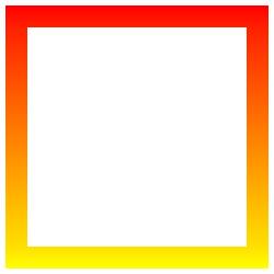
The sample code is as follows.
<div class="content"></div>
<style>
.content {
    width: 200px;
    height: 200px;
    border:20px solid #ddd;
    border-image: -webkit-linear-gradient(red,yellow) 30 30;
    border-image: -moz-linear-gradient(red,yellow) 30 30;
    border-image: linear-gradient(red,yellow) 30 30;
}
</style>
The effect is as follows.
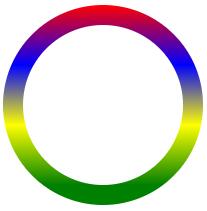
But border-image cannot achieve rounded corners. So, we need to change our thinking. To achieve this through padding, please set the gradient background for the parent node, and simulate the border through padding (the padding value here is the value required by the border). Note that the value of the border-radius property of the parent and child elements remains the same.
<div class="content">
	<div class="box"></div>
</div>
<style>
.content {
    width: 200px;
    height: 200px;
    box-sizing: border-box;
    padding: 20px;
    border-radius: 50%;
    background-image: -webkit-linear-gradient(top, red 0%, blue 30%, yellow 60%, green 90%);
    background-image: -moz-linear-gradient(top, red 0%, blue 30%, yellow 60%, green 90%);
    background-image: linear-gradient(top, red 0%, blue 30%, yellow 60%, green 90%);
}
.box {
    width:100%;
    height:100%;
    border-radius:50%;
    background:#fff;
}
</style>
The effect is as follows.