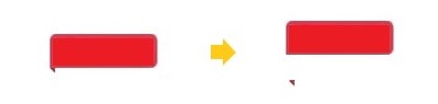
I recently encountered such a corner logo design in a project. The text is customizable and the size needs to be adaptive. Such a design layout can naturally be implemented with CSS.

Let's take a look at how to use CSS to achieve the corner effect.
How to Use CSS to Achieve the Corner Effect
From the design can be split into two parts, a rounded rectangle and a triangle.
Suppose the HTML is like this.
<tag>Example</tag>
Rounded corners are easy to achieve by using the border-radius. The example is as follows.
tag{
  border-radius: 4px 4px 4px 0px;
  color: #fff;
  padding: 2px 6px;
  font-size: 10px;
  line-height: 16px;
  background: #EA3447;
}
Small triangles can be generated with pseudo-elements. There are many ways to implement triangles. If there is no requirement for compatibility, it is recommended to use "clip-path". It is easier to understand. Determine three coordinates and cut them directly.
Implementing it in CSS:
tag::before{
    content: '';
    position: absolute;
    width: 3px;
    height: 3px;
    left: 0;
    bottom: -3px;
    background: #BB2A39;
    clip-path: polygon(0 0, 100% 0, 100% 100%); /*Triangle*/
}
The overall implementation is actually not too difficult. If the designer has no requirements, in fact, this step can be over. But it can also make the original design more textured, and it can also improve the overall visual experience of the website.
How to Improve the Effect with CSS
1. A Slightly Darker Triangle
In the above implementation, two colors are used for rounded rectangles and triangles, and two colors are used for triangles, namely #EA3447 and #BB2A39.
It is too troublesome to maintain two color variables every time, is there a way to use only one color? In other words, how to darken a color? There are several ways here.
1. Cover with a layer of translucent black
This is actually easier to understand. In the original color, cover a layer of translucent black, and the original color will naturally darken. The specific implementation is to draw a layer of the semi-transparent gradient with a CSS background.
tag::before{
  background: linear-gradient(rgba(0, 0, 0, 0.3), rgba(0, 0, 0, 0.3));
  background-color: inherit;
}
2. Through the filter to achieve
There is a brightness in the CSS filter, which can set the brightness of the image. The higher the brightness, the whiter the image. When it is infinity, it is close to white. The lower the brightness, the darker the image. in this scenario. The CSS example is as follows.
tag::before{
  filter: brightness(.7);
  background-color: inherit;
}
Similar effects can be achieved with other saturates and grayscale filters, but brightness is more appropriate here.
3. The future solution color-mix
You may have used color processing schemes in some CSS preprocessing, such as reducing the brightness of a color by 20%, which may be the case in less.
.el{
  background: darken(@color, 20%);
}
However, these are pre-processed, the changes are not real-time and sometimes may not meet the actual needs. Now, the new color scheme has to be implemented in CSS, that is color-mix, which is color mixing, which is currently in the draft. If it is fully supported in the future, darkening a color can be done like this. (from in the example means to expand the original color, and then recalculate it into a new color.)
.el{
  --accent: #EA3447;
  background: hsl(from var(--accent) h s calc(l - 20%));
}
2. Textured Highlights
In order to highlight a certain texture, designers usually add a "faint highlight" to the label. Some are similar to a solid color fill and a gradient fill. In order to ensure the unity of the color variable, the highlights can be achieved with a semi-transparent white gradient. The example below draws a semi-transparent white gradient from the upper left to the lower right, overlaid on the original color.
tag{
  background: linear-gradient(to right bottom, rgba(255, 255, 255, 0.4), transparent) rgba(20, 30, 41, 0.76));
}
Because it is just a simple and rude superposition, the overall result is white, and there is a feeling of insufficient saturation. The reason is that the superposition is not natural enough. So how do superimpose it more naturally? You can use background-blend-mode, which is the background blending mode. In order to make the overlay look softer, soft-light can be used here, the example is as follows.
tag{
  background-blend-mode: soft-light
}
In summary, the complete code is as follows.
tag{
  border-radius: 4px 4px 4px 0px;
  color: #fff;
  padding: 2px 6px;
  font-size: 10px;
  line-height: 16px;
  background: linear-gradient(to right bottom, rgba(255, 255, 255, 0.4), transparent) var(--bg, #EA3447);
  background-blend-mode: soft-light;
}
tag::before{
  content: '';
  position: absolute;
  width: 3px;
  height: 3px;
  left: 0;
  bottom: -3px;
  background-color: inherit;
  filter: brightness(.7);
  clip-path: polygon(0 0, 100% 0, 100% 100%);
}
In addition to some of the CSS effect suggestions above, you can also refer to the following practical suggestions.
1. The adaptive size should be implemented with CSS as much as possible.
2. The implementation of the triangle recommends "clip-path", which is easier to understand.
3. Fully consider the maintainability of the implementation. For example, if you can use one variable, don't use two variables, and the same is true for CSS.
4. Overlay a layer of translucent black to darken the image.
5. Image darkening can also be achieved with the CSS filter brightness.
6. The background blending mode allows the colors to be superimposed according to nature.
7. In the future, it can also be achieved by color mixing color-mix, you can learn about it in advance.