Trying to draw a button: how to set a stroke color and how to align a gradient to the bottom without knowing the height?
In terms of your first question, I struggled with this as well, and it doesn't look like there are any suitable methods within Drawables themselves (I was using ShapeDrawable) or the Paint class. However, I was able to extend ShapeDrawable and override the draw method, as below, to give the same result:
public class CustomBorderDrawable extends ShapeDrawable {
    private Paint fillpaint, strokepaint;
    private static final int WIDTH = 3;

    public CustomBorderDrawable(Shape s) {
        super(s);
        fillpaint = this.getPaint();
        strokepaint = new Paint(fillpaint);
        strokepaint.setStyle(Paint.Style.STROKE);
        strokepaint.setStrokeWidth(WIDTH);
        strokepaint.setARGB(255, 0, 0, 0);
    }

    @Override
    protected void onDraw(Shape shape, Canvas canvas, Paint fillpaint) {
        shape.draw(canvas, fillpaint);
        shape.draw(canvas, strokepaint);
    }

    public void setFillColour(int c){
        fillpaint.setColor(c);
    }
}
Programmatically create a button with a gradient stroke?
I have tried something for you..
Use mRect.set to set path and mPath.addRoundRectadd rectangle.Use setShader for strock purpose link
Drawable class:
public class CustomDrawable extends Drawable {
Paint mPaint;
int startColor, endColor, mBorderWidth, mBorderRadius;
RectF mRect;
Path mPath;

public CustomDrawable(int startColor, int endColor, int borderWidth, int borderRadius) {
    mPaint = new Paint(Paint.ANTI_ALIAS_FLAG);
    mPaint.setStyle(Paint.Style.FILL);

    mPath = new Path();
    mPath.setFillType(Path.FillType.EVEN_ODD);

    mRect = new RectF();
    this.startColor = startColor;
    this.endColor = endColor;

    mBorderWidth = borderWidth;
    mBorderRadius = borderRadius;
}

@Override
protected void onBoundsChange(Rect bounds) {
    super.onBoundsChange(bounds);
    mPath.reset();

    // out rect
    mRect.set(bounds.left + mBorderWidth, bounds.top + mBorderWidth, bounds.right - mBorderWidth, bounds.bottom - mBorderWidth);
    mPath.addRoundRect(mRect, mBorderRadius, mBorderRadius, Path.Direction.CW);

    // inner rect
    mRect.set(bounds.left + 20, bounds.top + 20, bounds.right - 20, bounds.bottom - 20);
    mPath.addRoundRect(mRect, mBorderRadius, mBorderRadius, Path.Direction.CW);
}

@Override
public void draw(@NonNull Canvas canvas) {
    // kind of strock
    mPaint.setShader(new LinearGradient(0, 0, 0, 100, startColor, endColor, Shader.TileMode.MIRROR));
    canvas.drawPath(mPath, mPaint);
}
@Override
public void setAlpha(int alpha) { mPaint.setAlpha(alpha);}
@Override
public void setColorFilter(@Nullable ColorFilter colorFilter) {mPaint.setColorFilter(colorFilter);}
@Override
public int getOpacity() {return PixelFormat.TRANSLUCENT;}
}
Main :
Button but = ((Button)findViewById(R.id.but));
but.setBackground(new CustomDrawable(Color.parseColor("#FD659B"),
       Color.parseColor("#F76E63"),
       but.getPaddingLeft(), 100));
layout :
<Button
    android:id="@+id/but"
    android:layout_width="300dp"
    android:layout_height="80dp"
    android:background="@android:color/transparent"
    android:layout_centerInParent="true"
    android:text="Signin"/>
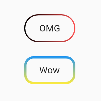
Outlined transparent button with gradient border in flutter
I spent about two hours on it :)
how to use:
import 'package:flutter/material.dart';

void main() => runApp(App());

class App extends StatelessWidget {
  @override
  Widget build(BuildContext context) {
    return MaterialApp(
      home: Scaffold(
        body: SafeArea(
          child: Center(
            child: Column(
              mainAxisSize: MainAxisSize.min,
              children: <Widget>[
                UnicornOutlineButton(
                  strokeWidth: 2,
                  radius: 24,
                  gradient: LinearGradient(colors: [Colors.black, Colors.redAccent]),
                  child: Text('OMG', style: TextStyle(fontSize: 16)),
                  onPressed: () {},
                ),
                SizedBox(width: 0, height: 24),
                UnicornOutlineButton(
                  strokeWidth: 4,
                  radius: 16,
                  gradient: LinearGradient(
                    colors: [Colors.blue, Colors.yellow],
                    begin: Alignment.topCenter,
                    end: Alignment.bottomCenter,
                  ),
                  child: Text('Wow', style: TextStyle(fontSize: 16)),
                  onPressed: () {},
                ),
              ],
            ),
          ),
        ),
      ),
    );
  }
}
and the class itself:
class UnicornOutlineButton extends StatelessWidget {
  final _GradientPainter _painter;
  final Widget _child;
  final VoidCallback _callback;
  final double _radius;

  UnicornOutlineButton({
    @required double strokeWidth,
    @required double radius,
    @required Gradient gradient,
    @required Widget child,
    @required VoidCallback onPressed,
  })  : this._painter = _GradientPainter(strokeWidth: strokeWidth, radius: radius, gradient: gradient),
        this._child = child,
        this._callback = onPressed,
        this._radius = radius;

  @override
  Widget build(BuildContext context) {
    return CustomPaint(
      painter: _painter,
      child: GestureDetector(
        behavior: HitTestBehavior.translucent,
        onTap: _callback,
        child: InkWell(
          borderRadius: BorderRadius.circular(_radius),
          onTap: _callback,
          child: Container(
            constraints: BoxConstraints(minWidth: 88, minHeight: 48),
            child: Row(
              mainAxisSize: MainAxisSize.min,
              mainAxisAlignment: MainAxisAlignment.center,
              children: <Widget>[
                _child,
              ],
            ),
          ),
        ),
      ),
    );
  }
}

class _GradientPainter extends CustomPainter {
  final Paint _paint = Paint();
  final double radius;
  final double strokeWidth;
  final Gradient gradient;

  _GradientPainter({@required double strokeWidth, @required double radius, @required Gradient gradient})
      : this.strokeWidth = strokeWidth,
        this.radius = radius,
        this.gradient = gradient;

  @override
  void paint(Canvas canvas, Size size) {
    // create outer rectangle equals size
    Rect outerRect = Offset.zero & size;
    var outerRRect = RRect.fromRectAndRadius(outerRect, Radius.circular(radius));

    // create inner rectangle smaller by strokeWidth
    Rect innerRect = Rect.fromLTWH(strokeWidth, strokeWidth, size.width - strokeWidth * 2, size.height - strokeWidth * 2);
    var innerRRect = RRect.fromRectAndRadius(innerRect, Radius.circular(radius - strokeWidth));

    // apply gradient shader
    _paint.shader = gradient.createShader(outerRect);

    // create difference between outer and inner paths and draw it
    Path path1 = Path()..addRRect(outerRRect);
    Path path2 = Path()..addRRect(innerRRect);
    var path = Path.combine(PathOperation.difference, path1, path2);
    canvas.drawPath(path, _paint);
  }

  @override
  bool shouldRepaint(CustomPainter oldDelegate) => oldDelegate != this;
}
How to add a stroke to ShapeDrawable
It looks like this person struggled with the same issue and the only way they found was to subclass the ShapeDrawable:
Trying to draw a button: how to set a stroke color and how to "align" a gradient to the bottom without knowing the height?
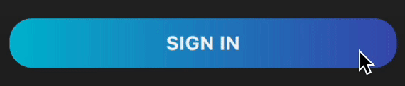
How to make Elevated Button with Gradient background?
Screenshot (Null safe)
Create this class (customizable)
class MyElevatedButton extends StatelessWidget {
  final BorderRadiusGeometry? borderRadius;
  final double? width;
  final double height;
  final Gradient gradient;
  final VoidCallback? onPressed;
  final Widget child;

  const MyElevatedButton({
    Key? key,
    required this.onPressed,
    required this.child,
    this.borderRadius,
    this.width,
    this.height = 44.0,
    this.gradient = const LinearGradient(colors: [Colors.cyan, Colors.indigo]),
  }) : super(key: key);

  @override
  Widget build(BuildContext context) {
    final borderRadius = this.borderRadius ?? BorderRadius.circular(0);
    return Container(
      width: width,
      height: height,
      decoration: BoxDecoration(
        gradient: gradient,
        borderRadius: borderRadius,
      ),
      child: ElevatedButton(
        onPressed: onPressed,
        style: ElevatedButton.styleFrom(
          backgroundColor: Colors.transparent,
          shadowColor: Colors.transparent,
          shape: RoundedRectangleBorder(borderRadius: borderRadius),
        ),
        child: child,
      ),
    );
  }
}
Usage:
Use it like a regular ElevatedButton:
MyElevatedButton(
  width: double.infinity,
  onPressed: () {},
  borderRadius: BorderRadius.circular(20),
  child: Text('SIGN IN'),
)
Android shape border with gradient
try something like this:
<?xml version="1.0" encoding="UTF-8"?>
<layer-list xmlns:android="http://schemas.android.com/apk/res/android" >

    <item>
        <shape android:shape="rectangle" >
            <gradient
                android:angle="360"
                android:centerColor="#e95a22"
                android:endColor="#ff00b5"
                android:gradientRadius="360"
                android:startColor="#006386"
                android:type="sweep" />

            <stroke
                android:width="2dp"
                android:color="#ff207d94" />
        </shape>
    </item>
    <item
        android:bottom="2dp"
        android:left="2dp"
        android:right="2dp"
        android:top="2dp">
        <shape android:shape="rectangle" >
            <solid android:color="#fff" />
        </shape>
    </item>

</layer-list>
Gradient stroke shape
Shape (rectangle) supports a gradient fill. You can also round the corners to get a nice toolbar button effect.
I don't think that stroke supports a gradient, but if you want a gradient stroke around your button you can create two layered rectangles - the first one using your gradient and the second using a solid or a different gradient sized to be 2 pixels smaller in height and width.
Related Topics
Scoping States in Jetpack Compose
How to Limit Fling in Android Gallery to Just One Item Per Fling
Swiperefreshlayout + Webview When Scroll Position Is at Top
Unexpected Namespace Prefix "Xmlns" Found for Tag Linearlayout
Can't Handle Both Click and Touch Events Simultaneously
Android: Changing Nfc Settings (On/Off) Programmatically
Set Visibility in Menu Programmatically Android
How to Check If Running on UI Thread in Android
How to Use Selector to Tint Imageview
Triggering Event When Button Is Pressed Down in Android
Communication Between Broadcastreceiver and Activity - Android
Highlighting the Selected Item in the Listview in Android
Fused Location Provider Unexpected Behavior
Rotate Zoom Drag Image in Android Imageview
Android: Onsaveinstancestate Not Being Called from Activity
How to Add PDFbox to an Android Project or Suggest Alternative