Rounded Button in Android
You can do a rounded corner button without resorting to an ImageView.
A background selector resource, button_background.xml:
<?xml version="1.0" encoding="utf-8" ?>
     <selector xmlns:android="http://schemas.android.com/apk/res/android">
     <!--  Non focused states
      -->
      <item android:state_focused="false" android:state_selected="false" android:state_pressed="false" android:drawable="@drawable/button_unfocused" />
      <item android:state_focused="false" android:state_selected="true" android:state_pressed="false" android:drawable="@drawable/button_unfocused" />
     <!--  Focused states
      -->
      <item android:state_focused="true" android:state_selected="false" android:state_pressed="false" android:drawable="@drawable/button_focus" />
      <item android:state_focused="true" android:state_selected="true" android:state_pressed="false" android:drawable="@drawable/button_focus" />
     <!--  Pressed
      -->
      <item android:state_pressed="true" android:drawable="@drawable/button_press" />
    </selector>
For each state, a drawable resource, e.g. button_press.xml:
<shape xmlns:android="http://schemas.android.com/apk/res/android" android:shape="rectangle">
  <stroke android:width="1dp" android:color="#FF404040" />
  <corners android:radius="6dp" />
  <gradient android:startColor="#FF6800" android:centerColor="#FF8000" android:endColor="#FF9700" android:angle="90" />
</shape>
Note the corners element, this gets you rounded corners!
Then set the background drawable on the button:
android:background="@drawable/button_background"
EDIT (9/2018): The same technique can be used to create a circular button. A circle is really just a square button with radius size set to 1/2 the side of the square
Additionally, in the example above the stroke and gradient aren't necessary elements, they are just examples and ways that you'll be able to see the rounded corner shape
How to make a round button?
Create an xml file named roundedbutton.xml in drawable folder
<?xml version="1.0" encoding="utf-8"?>
<shape xmlns:android="http://schemas.android.com/apk/res/android"
android:shape="rectangle">
    <solid android:color="#eeffffff" />
    <corners android:bottomRightRadius="8dp"
        android:bottomLeftRadius="8dp"
        android:topRightRadius="8dp"
        android:topLeftRadius="8dp"/>
</shape>
Finally set that as background to your Button as android:background = "@drawable/roundedbutton"
If you want to make it completely rounded, alter the radius and settle for something that is ok for you.
How to make the corners of a button round?
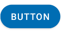
If you want something like this

here is the code.
1.Create a xml file in your drawable folder like mybutton.xml and paste the following markup:
<?xml version="1.0" encoding="utf-8"?>
<selector xmlns:android="http://schemas.android.com/apk/res/android" >
    <item android:state_pressed="true" >
        <shape android:shape="rectangle"  >
            <corners android:radius="3dip" />
            <stroke android:width="1dip" android:color="#5e7974" />
            <gradient android:angle="-90" android:startColor="#345953" android:endColor="#689a92"  />
        </shape>
    </item>
    <item android:state_focused="true">
        <shape android:shape="rectangle"  >
            <corners android:radius="3dip" />
            <stroke android:width="1dip" android:color="#5e7974" />
            <solid android:color="#58857e"/>
        </shape>
    </item>
    <item >
       <shape android:shape="rectangle"  >
            <corners android:radius="3dip" />
            <stroke android:width="1dip" android:color="#5e7974" />
            <gradient android:angle="-90" android:startColor="#8dbab3" android:endColor="#58857e" />
       </shape>
    </item>
</selector>
2.Now use this drawable for the background of your view. If the view is button then something like this:
<Button
    android:id="@+id/button1"
    android:layout_width="wrap_content"
    android:layout_height="wrap_content"
    android:padding="10dp"
    android:textColor="#ffffff"
    android:background="@drawable/mybutton"
    android:text="Buttons" />
Rounded corners on material button
Update:
Answer by Gabriele Mariotti below is now better.
Old answer:
You need to inherit that style.
Add into your styles.xml:
 <style name="AppTheme.RoundedCornerMaterialButton" parent="Widget.AppCompat.Button.Colored">
        <item name="android:background">@drawable/rounded_shape</item>
 </style>
Add file drawable/rounded_shape.xml:
<shape
    xmlns:android="http://schemas.android.com/apk/res/android"
    android:shape="rectangle"   >

    <solid
        android:color="@color/colorAccent" >
    </solid>

    <corners
        android:radius="11dp"   >
    </corners>

</shape>
And finally in your layout:
 <Button
       android:layout_width="wrap_content"
       android:layout_height="wrap_content"
       android:text="Test Text"
       style="@style/AppTheme.RoundedCornerMaterialButton"/>
Edit: updated answer to use theme's color rather than hardcoded one.
How to make buttons rounded with Material Design Theming?
Just use the app:shapeAppearanceOverlay attribute in the layout.
<com.google.android.material.button.MaterialButton
        app:shapeAppearanceOverlay="@style/buttomShape"
        .../>
with:
  <style name="buttomShape">
    <item name="cornerFamily">rounded</item>
    <item name="cornerSize">50%</item>
  </style>
The only way to apply it to all buttons is to define custom styles for all the button styles as you are just doing. Something like:
  <style name="...." parent="Widget.MaterialComponents.Button">
    <item name="shapeAppearance">@style/buttomShape</item>
  </style>

  <style name="..."  parent="Widget.MaterialComponents.Button.TextButton">
    <item name="shapeAppearance">@style/buttomShape</item>
  </style>
Buttons with rounded corners in android
To speed up the process I actually came across this tool that generate code for your xml http://angrytools.com/android/button/ After you have modified the button to your liking all the user just has to do is copy the xml generated code into their application. The tool has a lot of customisation options which include Size, Padding, Corners, Background, Padding and Stroke.
Can`t round the corners of the button
Alright, I tested on my Studio with my launcher icon as the image inside and I got the required result. Here's the entire xml:
<?xml version="1.0" encoding="utf-8"?>
<android.support.constraint.ConstraintLayout
 xmlns:android="http://schemas.android.com/apk/res/android"
 xmlns:app="http://schemas.android.com/apk/res-auto"
 android:layout_width="match_parent"
 android:layout_height="match_parent">

<ImageButton
    android:id="@+id/bottle"
    android:layout_width="100dp"
    android:layout_height="100dp"
    android:contentDescription="@null"
    app:srcCompat="@mipmap/ic_launcher"
    android:background="@drawable/rouncorners"/>

</android.support.constraint.ConstraintLayout>
And the xml to be placed in the drawable file is:
<?xml version="1.0" encoding="UTF-8"?>
<shape xmlns:android="http://schemas.android.com/apk/res/android">
    <stroke android:width="3dip" android:color="@color/profile_cover" />
    <corners android:radius="10dp" />
 </shape>
The result was as follows:

This is what you're looking for right? It have rounded corner and an image inside.
How to make a button with rounded corners, background image and text in android
You can use CardView or If you want to create Button, try this xml drawable:
<?xml version="1.0" encoding="utf-8"?>
<layer-list xmlns:android="http://schemas.android.com/apk/res/android" >
    <item>
        <shape android:shape="rectangle" android:padding="5dp">
            <corners
                 android:bottomRightRadius="4dp"
                 android:bottomLeftRadius="4dp"
                 android:topLeftRadius="4dp"
                 android:topRightRadius="4dp"/>
         </shape>
   </item>
   <item android:drawable="@drawable/yourImage" />
</layer-list>
Related Topics
How to Use Android Emulator for Testing Bluetooth Application
Scaled Bitmap Maintaining Aspect Ratio
Interstitial Admob Ads: "Illegalstateexception: Only Fullscreen Activities Can Request Orientation"
Android Application Class Lifecycle
How to Notify Users About an Android App Update
Android Install on Device Failure [Install_Canceled_By_User]
Android Mapview -Setting Zoom Automatically Until All Itemizedoverlay's Are Visible
Android - Play Sound on Button Click - Null Pointer Exception
Adjust Layout When Soft Keyboard Is On
Insertion of Thousands of Contact Entries Using Applybatch Is Slow
Prevent Ussd Dialog and Read Ussd Response
View with Horizontal and Vertical Pan/Drag and Pinch-Zoom
How to Read and Edit Android Calendar Events Using the New Android 4.0 Ice Cream Sandwich API