ListView item background via custom selector
I've been frustrated by this myself and finally solved it. As Romain Guy hinted to, there's another state, "android:state_selected", that you must use. Use a state drawable for the background of your list item, and use a different state drawable for listSelector of your list:
list_row_layout.xml:
<?xml version="1.0" encoding="utf-8"?>
<LinearLayout
    xmlns:android="http://schemas.android.com/apk/res/android"
    android:layout_width="fill_parent"
    android:layout_height="?android:attr/listPreferredItemHeight"
    android:background="@drawable/listitem_background"
    >
...
</LinearLayout>
listitem_background.xml:
<?xml version="1.0" encoding="utf-8"?>
<selector xmlns:android="http://schemas.android.com/apk/res/android">
    <item android:state_selected="true" android:drawable="@color/android:transparent" />
    <item android:drawable="@drawable/listitem_normal" />
</selector>
layout.xml that includes the ListView:
...
<ListView
   android:layout_width="fill_parent"
   android:layout_height="wrap_content"
   android:listSelector="@drawable/listitem_selector"
   />
...
listitem_selector.xml:
<?xml version="1.0" encoding="utf-8"?>
<selector xmlns:android="http://schemas.android.com/apk/res/android">
    <item android:state_pressed="true" android:drawable="@drawable/listitem_pressed" />
    <item android:state_focused="true" android:drawable="@drawable/listitem_selected" />
</selector>
ListView item background using custom selector
There might be two things.
One: You may need to make the LinearLayout ' android:clickable ' or ' android:focusable'. This is because by default a layouts are not clickable. Where the android default simple_list_item is.
Two: I also believe when dealing with custom rows, you need to assign your selector to the background of the custom row (image_text_layout.xml) LinearLayout and not to the listview. I'm not too sure.
Custom selector for list background
Use android:state_pressed to specify pressed states.
Drawable to use: /res/drawable/bg.xml
<shape xmlns:android="http://schemas.android.com/apk/res/android">
  <solid android:color="@android:color/holo_red_dark"/>
</shape>
Selector to use: /res/drawable/item.xml
<selector xmlns:android="http://schemas.android.com/apk/res/android">
    <item android:state_pressed="true" android:drawable="@drawable/bg"/>
</selector>
ListView:
    <ListView
    android:id="@+id/list"
    android:layout_width="match_parent"
    android:layout_height="fill_parent"
    android:saveEnabled="true"
    android:listSelector="@drawable/item"
    />
Result on pressing a list item:
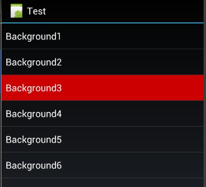
Note: List selector is drawn behind Item View, Item View may have its own background.
Set Background image, if the Custom Listview item is pressed
You will use this custom adapter in you listview
public class CustomAdapter extends ArrayAdapter<Sample> {

public ArrayList<Sample> mlist;
public Context context;
public LayoutInflater inflater;
public int[] i ;
public int start=0;
private LinearLayout layout;
private View view;
private View mLastView;

public CustomAdapter(Context context, int resource, ArrayList<Sample> mlist) {
    super(context, resource);
    this.mlist = mlist;
    start=0;
    this.context = context;
    i = new int[this.mlist.size()];
    inflater = (LayoutInflater) context
            .getSystemService(Context.LAYOUT_INFLATER_SERVICE);
}

@Override
public int getPosition(Sample item) {
    return super.getPosition(item);
}

@Override
public Sample getItem(int position) {
    return mlist.get(position);
}

@Override
public int getCount() {
    return mlist.size();
}

@Override
public long getItemId(int position) {
    return super.getItemId(position);
}

@Override
public View getView(final int position, View convertView, ViewGroup parent) {
     view = inflater.inflate(R.layout.listitem, null);
    layout = (LinearLayout)view.findViewById(R.id.linearlayoutSample);;
    TextView text1 = (TextView) view.findViewById(R.id.item1);
    TextView text2 = (TextView) view.findViewById(R.id.item2);
    layout.setBackgroundColor(Color.BLACK);
    text1.setText(mlist.get(position).getListitem1());
    text2.setText(mlist.get(position).getListitem2());
    layout.setOnClickListener(new OnClickListener() {
        @Override
        public void onClick(View v) {
            if(start==0)
            {
                mLastView = v;
                start++;
            }

            if(start>0)
            {
                mLastView.setBackgroundColor(Color.BLACK);
                mLastView = v;
            }

            v.setBackgroundColor(Color.GRAY);
        }
    });
    return view;
}

}
In Android how do you use a selector on a ListView to change the background color that will allow the text to appear as well?
Create a sub folder in res called color. Use that folder to create new color selectors.
<selector xmlns:android="http://schemas.android.com/apk/res/android">

    <item android:state_pressed="true" android:color="pressed_color"/>
    <item android:color="default_color"/>

</selector>
From there, use the TextView:textColor attribute and apply the selector.
android:textColor="@color/your_selector"
Edit
First, remove the line android:drawSelectorOnTop="true" from your ListView. This is the reason the item in your ListView is being covered up. Next, create a custom selector for your row background that uses a transparent color when the item is touched. This way, your list selector will be shown in place of the background of the item.
<selector xmlns:android="http://schemas.android.com/apk/res/android">

    <item android:drawable="@android:color/transparent" android:state_pressed="true"/>
    <item android:drawable="your_default_color"/>

</selector>
Apply this selector to using the android:background attribute.
How to set the initial ListView item background color with a selector
- For list items define a selector drawable:
res/drawable/list_item_background.xml
<?xml version="1.0" encoding="utf-8"?>
<selector xmlns:android="http://schemas.android.com/apk/res/android" >

    <item android:state_enabled="true" android:state_pressed="true" android:drawable="@color/red" /> <!-- Pressed state -->
    <item android:state_enabled="true" android:state_focused="true" android:drawable="@color/black" /> <!-- Focused state -->
    <item android:state_enabled="true" android:state_selected="true" android:drawable="@color/orange" /> <!-- Selected state -->
    <item android:drawable="@color/gray" /> <!-- Default state -->

</selector>
- Set the above drawable as background for individual list item:
res/layout/list_item.xml
<?xml version="1.0" encoding="utf-8"?>
<LinearLayout xmlns:android="http://schemas.android.com/apk/res/android"
    android:layout_width="match_parent"
    android:layout_height="?android:attr/listPreferredItemHeight"
    android:background="@drawable/list_item_background" >

    <TextView
        android:layout_width="match_parent"
        android:layout_height="match_parent"
        android:id="@+id/listitem" />

</LinearLayout>
Use the above custom layout for creating the list items:
String[] mStrings = {"One", "Two", "Three", "Four"};
ListView list = (ListView) rootView.findViewById(R.id.list);
list.setAdapter(new ArrayAdapter<String>(this.getActivity(), R.layout.list_item, R.id.listitem ,mStrings));
ListView Item shadow + custom selector
I've found solution. The reason why seletor doesn't appear is Android ListView structure. If you set background to List ItemView it overlaps Selector, so you can't see it. Solution is to make ItemView background transparent on Click.
Here is listview_item_shadow.xml:
<?xml version="1.0" encoding="utf-8"?>
<layer-list xmlns:android="http://schemas.android.com/apk/res/android">
    <item>
        <shape android:shape="rectangle">
              <solid android:color="@android:color/darker_gray" />
        </shape>
    </item>
     <item
         android:right="1dp"
         android:bottom="2dp">
        <shape android:shape="rectangle">
              <solid android:color="@android:color/white"/>
        </shape>
     </item>
</layer-list>
Now you should use it in selector for ItemView! - listview_item_backgroundstate.xml
You need to set listview_item_backgroundstate.xml as background to your ListView item
<?xml version="1.0" encoding="utf-8"?>
<selector xmlns:android="http://schemas.android.com/apk/res/android">
    <item android:state_pressed="true" android:drawable="@android:color/transparent"></item>
    <item android:state_selected="true" android:drawable="@android:color/transparent"></item>
    <item android:state_focused="true" android:drawable="@android:color/transparent"></item>
    <item android:drawable="@drawable/listview_item_shadow"></item>
</selector>
And at last you have to set custom_selector.xml as in ListView. android:listSelector="@drawable/custom_selector.xml"
<?xml version="1.0" encoding="utf-8"?>
<selector xmlns:android="http://schemas.android.com/apk/res/android">
<item
    android:state_pressed="false"
    android:drawable="@android:drawable/color/white" />
<item
    android:state_pressed="true"
    android:drawable="@drawable/pressed_background_blue" />
</selector>
For more info read this awesome tutorial
Related Topics
Save Arraylist to Sharedpreferences
How to Send an Object from One Android Activity to Another Using Intents
Simple Android Recyclerview Example
Is There an Addheaderview Equivalent For Recyclerview
How to Connect to Android With Adb Over Tcp
Auto Scale Textview Text to Fit Within Bounds
How to Start New Activity on Button Click
Programmatically Obtain the Phone Number of the Android Phone
Checking If an Android Application Is Running in the Background
How to Retrieve Data from Firebase to My Adapter
Android Activity Life Cycle - What Are All These Methods For
Capture Image from Camera and Display in Activity
Android Marshmallow Request Permission
How to Convert a Base64 String into a Bitmap Image to Show It in a Imageview
This App Won't Run Unless You Update Google Play Services (Via Bazaar)
Using the Android Application Class to Persist Data
How to Send Device to Device Notification by Using Fcm Without Using Xmpp or Any Other Script.