How can we reduce the gap between tab layout text and its indicator
Try this
<android.support.design.widget.CoordinatorLayout xmlns:android="http://schemas.android.com/apk/res/android"
    xmlns:app="http://schemas.android.com/apk/res-auto"
    android:id="@+id/htab_maincontent"
    android:layout_width="match_parent"
    android:layout_height="match_parent"
    android:fitsSystemWindows="true">


    <android.support.design.widget.AppBarLayout
        android:id="@+id/htab_appbar"
        android:layout_width="match_parent"
        android:layout_height="wrap_content"
        android:background="#2fff00"
        android:fitsSystemWindows="true"
        android:theme="@style/ThemeOverlay.AppCompat.Dark.ActionBar">

        <android.support.design.widget.CollapsingToolbarLayout
            android:id="@+id/htab_collapse_toolbar"
            android:layout_width="match_parent"
            android:layout_height="match_parent"
            android:fitsSystemWindows="true"
            app:contentScrim="?attr/colorPrimary"
            app:expandedTitleMarginEnd="64dp"
            app:expandedTitleMarginStart="48dp"
            app:layout_scrollFlags="scroll|exitUntilCollapsed"
            app:titleEnabled="false">


            <android.support.v7.widget.Toolbar
                android:id="@+id/htab_toolbar"
                android:layout_width="match_parent"
                android:layout_height="?attr/actionBarSize"
                android:background="@android:color/transparent"
                app:contentInsetStart="0dp"
                app:layout_collapseMode="pin"
                app:popupTheme="@style/ThemeOverlay.AppCompat.Light" />

            <ImageView
                android:id="@+id/htab_header"
                android:layout_width="match_parent"
                android:layout_height="wrap_content"
                android:background="@drawable/ic_launcher_background"
                app:layout_collapseMode="parallax" />


        </android.support.design.widget.CollapsingToolbarLayout>

        <android.support.design.widget.TabLayout
            android:id="@+id/htab_tabs"
            android:layout_width="match_parent"
            android:layout_height="35dp"
            android:layout_gravity="bottom"
            android:background="@drawable/tab_selector"
            app:layout_anchor="@+id/MyAppbar"
            app:layout_anchorGravity="bottom"
            app:tabGravity="fill"
            app:tabIndicatorColor="#F21757"
            app:tabMode="scrollable"
            app:tabSelectedTextColor="#F21757"
            app:tabTextColor="@android:color/white" />


    </android.support.design.widget.AppBarLayout>

    <android.support.v4.view.ViewPager
        android:id="@+id/viewpager"
        android:layout_width="match_parent"
        android:layout_height="match_parent"
        app:layout_behavior="@string/appbar_scrolling_view_behavior" />

</android.support.design.widget.CoordinatorLayout>
drawable/tab_selector
<?xml version="1.0" encoding="utf-8"?>
<selector xmlns:android="http://schemas.android.com/apk/res/android">
    <item android:state_selected="true" android:state_pressed="false">
        <layer-list xmlns:android="http://schemas.android.com/apk/res/android">

            <item android:top="-2dp" android:left="-5dp" android:right="-5dp" android:bottom="2dp">
                <shape android:shape="rectangle">

                    <solid android:color="@android:color/white"/>
                    <stroke android:color="@color/colorPrimary" android:width="2dp"/>

                </shape>
            </item>
        </layer-list>
    </item>

    <item android:state_selected="true" android:state_pressed="true">
        <layer-list xmlns:android="http://schemas.android.com/apk/res/android">

            <item android:top="-2dp" android:left="-5dp" android:right="-5dp" android:bottom="2dp">
                <shape android:shape="rectangle">

                    <solid android:color="@android:color/white"/>
                    <stroke android:color="@color/colorPrimary" android:width="2dp"/>

                </shape>
            </item>
        </layer-list>
    </item>

</selector>
TabLayout set spacing or margin each tab
Been fighting this problem for a while too, found the solution on this thread : Android Design Support Library TabLayout using custom tabs layout but layout wrapping the tabs
<!-- Add the padding to tabPaddingStart and/or tabPaddingEnd -->
<android.support.design.widget.TabLayout
        android:id="@+id/tabLayout"
        android:layout_width="match_parent"
        android:layout_height="@dimen/tab_layout_height"
        app:tabPaddingStart="10dp"
        app:tabPaddingEnd="10dp">
Reduce the gap between tablayout and view pager
Use RelativeLayout like this -
 <RelativeLayout
    android:layout_width="match_parent"
    android:layout_height="wrap_content">

  <android.support.v4.view.ViewPager
    android:layout_width="match_parent"
    android:layout_height="130dp"
    android:layout_marginTop="5dp"
    android:id="@+id/homeOffers"/>

  <android.support.design.widget.TabLayout
    android:layout_width="match_parent"
    android:layout_height="wrap_content"
    android:id="@+id/indicator"
    app:tabGravity="center"
    app:tabIndicatorHeight="0dp"
    app:tabBackground="@drawable/tab_selector"
    android:layout_below="@id/homeOffers/>

 </RelativeLayout>
And remove this line from your cardview -
app:cardUseCompatPadding="true"
Android Tab layout: Wrap tab indicator width with respect to tab title
Yes, it's possible to wrap tab indicator as title setting padding to 0
 public void wrapTabIndicatorToTitle(TabLayout tabLayout, int externalMargin, int internalMargin) {
        View tabStrip = tabLayout.getChildAt(0);
        if (tabStrip instanceof ViewGroup) {
            ViewGroup tabStripGroup = (ViewGroup) tabStrip;
            int childCount = ((ViewGroup) tabStrip).getChildCount();
            for (int i = 0; i < childCount; i++) {
                View tabView = tabStripGroup.getChildAt(i);
                //set minimum width to 0 for instead for small texts, indicator is not wrapped as expected
                tabView.setMinimumWidth(0);
                // set padding to 0 for wrapping indicator as title
                tabView.setPadding(0, tabView.getPaddingTop(), 0, tabView.getPaddingBottom());
                // setting custom margin between tabs
                if (tabView.getLayoutParams() instanceof ViewGroup.MarginLayoutParams) {
                    ViewGroup.MarginLayoutParams layoutParams = (ViewGroup.MarginLayoutParams) tabView.getLayoutParams();
                    if (i == 0) {
                        // left
                        settingMargin(layoutParams, externalMargin, internalMargin);
                    } else if (i == childCount - 1) {
                        // right
                        settingMargin(layoutParams, internalMargin, externalMargin);
                    } else {
                        // internal
                        settingMargin(layoutParams, internalMargin, internalMargin);
                    }
                }
            }

            tabLayout.requestLayout();
        }
}

private void settingMargin(ViewGroup.MarginLayoutParams layoutParams, int start, int end) {
    if (Build.VERSION.SDK_INT >= Build.VERSION_CODES.JELLY_BEAN_MR1) {
        layoutParams.setMarginStart(start);
        layoutParams.setMarginEnd(end);
        layoutParams.leftMargin = start;
        layoutParams.rightMargin = end;
    } else {
        layoutParams.leftMargin = start;
        layoutParams.rightMargin = end;
    }
}

EDIT:
As of com.android.support:design:28.0.0, you can adjust the indicator as label easily now setting:
app:tabIndicatorFullWidth="false"
EDIT July 2019:
Use the material dependencycom.google.android.material:material:x.x.x
Android remove space between tabs in tabwidget
For removing the grey line at the bottom of your tabbar, you can set
tabHost.getTabWidget().setStripEnabled(false);
As of removing the gap between the tabs.. The best way would be to use your own drawable without any paddings. You can use images for this, or you can create your tabs' backgrounds via xml's, say inside a <layer_list> root element:
<layer_list>
    <item android:top="0dp" android:left="0dp" android:right="0dp" android:bottom="0dp">
        <shape android:shape="rectangle">
        [..]
        </shape>
    </item>
    [..]
</layer_list>
and set this drawable to be the background of your TabWidget.
To see how to customize your tabs, there are a lot of tutorials on the web. For example this one by Josh is short and has a nice explanation.
Update
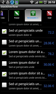
Here I share a small sample of tabwidget using custom tabs (based on your code) to achieve the following output:
What you need:
- three new layer drawables (for
selected, focused and unselected
states of the tabs) - two state drawables (for the text
and background of the different
states) - a new layout for the tabs
- update your
main.xml - update your activity class
- update your androidManifest.xml
(remove the style declarations)
The three layer drawables: tab_normal.xml, tab_focused.xml, tab_selected.xml
drawable/tab_normal.xml:
<?xml version="1.0" encoding="utf-8"?>
<layer-list xmlns:android="http://schemas.android.com/apk/res/android">
    <item>
        <shape android:shape="rectangle">
            <solid android:color="@color/default_back_color" />
        </shape>
    </item>
    <item android:top="2dp">
        <shape android:shape="rectangle">
            <gradient android:startColor="#AAAAAA" android:centerColor="#888888"
                android:endColor="#666666" android:angle="90" />
            <corners android:bottomRightRadius="0dp"
                android:bottomLeftRadius="0dp" android:topLeftRadius="10dp"
                android:topRightRadius="10dp" />
        </shape>
    </item>
    <item android:top="4dp" android:left="1dp" android:right="1dp"
        android:bottom="0dp">
        <shape android:shape="rectangle">
            <solid android:color="@color/default_back_color" />
            <corners android:bottomRightRadius="0dp"
                android:bottomLeftRadius="0dp" android:topLeftRadius="8dp"
                android:topRightRadius="8dp" />
        </shape>
    </item>
</layer-list>
drawable/tab_focused.xml:
<?xml version="1.0" encoding="utf-8"?>
<layer-list xmlns:android="http://schemas.android.com/apk/res/android">
    <item>
        <shape android:shape="rectangle">
            <solid android:color="@color/default_back_color" />
        </shape>
    </item>
    <item android:top="2dp">
        <shape android:shape="rectangle">
            <gradient android:startColor="#AAAAAA" android:centerColor="#888888"
                android:endColor="#666666" android:angle="90" />
            <corners android:bottomRightRadius="0dp"
                android:bottomLeftRadius="0dp" android:topLeftRadius="10dp"
                android:topRightRadius="10dp" />
        </shape>
    </item>
    <item android:top="4dp" android:left="1dp" android:right="1dp"
        android:bottom="0dp">
        <shape android:shape="rectangle">
            <gradient android:startColor="#8F8F8F" android:centerColor="#656565"
                android:endColor="#3F3F3F" android:angle="90" />
            <corners android:bottomRightRadius="0dp"
                android:bottomLeftRadius="0dp" android:topLeftRadius="8dp"
                android:topRightRadius="8dp" />
        </shape>
    </item>
</layer-list>
drawable/tab_selected.xml:
<?xml version="1.0" encoding="utf-8"?>
<layer-list xmlns:android="http://schemas.android.com/apk/res/android">
    <item>
        <shape android:shape="rectangle">
            <solid android:color="@color/default_back_color" />
        </shape>
    </item>
    <item android:top="2dp">
        <shape android:shape="rectangle">
            <gradient android:startColor="#EEEEEE" android:centerColor="#CCCCCC"
                android:endColor="#AAAAAA" android:angle="-90" />
            <corners android:bottomRightRadius="0dp"
                android:bottomLeftRadius="0dp" android:topLeftRadius="10dp"
                android:topRightRadius="10dp" />
        </shape>
    </item>
    <item android:top="4dp" android:left="1dp" android:right="1dp"
        android:bottom="0dp">
        <shape android:shape="rectangle">
            <gradient android:startColor="#EAEAEA" android:centerColor="#9F9F9F"
                android:endColor="#696969" android:angle="90" />
            <corners android:bottomRightRadius="0dp"
                android:bottomLeftRadius="0dp" android:topLeftRadius="8dp"
                android:topRightRadius="8dp" />
        </shape>
    </item>
</layer-list>
The two state drawables: tab_background_selector.xml, tab_text_selector.xml
drawable/tab_background_selector.xml:
<?xml version="1.0" encoding="utf-8"?>
<selector xmlns:android="http://schemas.android.com/apk/res/android">
    <item android:state_selected="true" android:state_focused="false"
        android:state_pressed="false" android:drawable="@drawable/tab_selected"/>
    <item android:state_selected="false" android:state_focused="false"
        android:state_pressed="false" android:drawable="@drawable/tab_normal" />
    <item android:state_pressed="true" android:drawable="@drawable/tab_focused"/>
    <item android:state_focused="true" android:state_selected="true"
        android:state_pressed="false" android:drawable="@drawable/tab_selected"/>
</selector>
drawable/tab_text_selector.xml:
<?xml version="1.0" encoding="utf-8"?>
<selector xmlns:android="http://schemas.android.com/apk/res/android">
    <item android:state_selected="true" android:color="#1589FF" />
    <item android:state_focused="true" android:color="#1589FF" />
    <item android:state_pressed="true" android:color="@android:color/white" />
    <item android:color="#F0F0F0" />
</selector>
The new layout for the tabs: tab.xml
layout/tab.xml
<?xml version="1.0" encoding="utf-8"?>
<LinearLayout xmlns:android="http://schemas.android.com/apk/res/android"
    android:layout_width="fill_parent" android:layout_height="fill_parent"
    android:background="@drawable/tab_background_selector" android:gravity="center"
    android:orientation="vertical" android:padding="5dp">
    <ImageView android:id="@+id/tab_icon" android:layout_width="30dp"
        android:layout_height="30dp" android:scaleType="fitCenter" />
    <TextView android:id="@+id/tab_text" android:layout_width="wrap_content"
        android:layout_height="wrap_content" android:singleLine="true"
        android:textStyle="bold" android:gravity="center_horizontal"
        android:textSize="10sp" android:padding="3dip" android:ellipsize="marquee"
        android:textColor="@drawable/tab_text_selector" />
</LinearLayout>
main.xml:
<?xml version="1.0" encoding="utf-8"?>
<LinearLayout xmlns:android="http://schemas.android.com/apk/res/android"
    android:orientation="vertical" android:layout_width="fill_parent"
    android:layout_height="fill_parent">
    <TabHost android:id="@android:id/tabhost" android:layout_width="fill_parent"
        android:layout_height="fill_parent">
        <LinearLayout android:orientation="vertical"
            android:layout_width="fill_parent" android:layout_height="fill_parent">
            <HorizontalScrollView android:scrollbars="none"
                android:layout_width="fill_parent" android:layout_height="wrap_content">
                <TabWidget android:id="@android:id/tabs"
                    android:layout_width="fill_parent" android:layout_height="wrap_content" />
            </HorizontalScrollView>
            <FrameLayout android:id="@android:id/tabcontent"
                android:layout_width="fill_parent" android:layout_height="fill_parent"
                android:padding="5dp" />
        </LinearLayout>
    </TabHost>
</LinearLayout>
InfralineTabWidget.java:
public class InfralineTabWidget extends TabActivity
{
    public void onCreate(Bundle savedInstanceState)
    {
        super.onCreate(savedInstanceState);
        setContentView(R.layout.main);
        final TabHost tabHost = (TabHost) getTabHost();

        tabHost.addTab(createTab(TopNewsActivity.class,
                "topNews", "Top News", R.drawable.tab_news));
        tabHost.addTab(createTab(PowerActivity.class,
                "power", "Power", R.drawable.tab_power));
        tabHost.addTab(createTab(EnergyActivity.class,
                "energy", "Renewable Energy", R.drawable.tab_energy));
        tabHost.addTab(createTab(CoalActivity.class,
                "coal", "Coal", R.drawable.tab_coal));
        tabHost.addTab(createTab(OilnGasActivity.class,
                "oilnGas", "Oil & Gas", R.drawable.tab_oilngas));

        tabHost.setCurrentTab(0);
        tabHost.getTabWidget().getChildAt(0).getLayoutParams().width = 140;
        tabHost.getTabWidget().getChildAt(1).getLayoutParams().width = 140;
        tabHost.getTabWidget().getChildAt(2).getLayoutParams().width = 140;
        tabHost.getTabWidget().getChildAt(3).getLayoutParams().width = 140;
        tabHost.getTabWidget().getChildAt(4).getLayoutParams().width = 140;
    }

    private TabSpec createTab(final Class<?> intentClass, final String tag,
            final String title, final int drawable)
    {
        final Intent intent = new Intent().setClass(this, intentClass);

        final View tab = LayoutInflater.from(getTabHost().getContext()).
            inflate(R.layout.tab, null);
        ((TextView)tab.findViewById(R.id.tab_text)).setText(title);
        ((ImageView)tab.findViewById(R.id.tab_icon)).setImageResource(drawable);

        return getTabHost().newTabSpec(tag).setIndicator(tab).setContent(intent);
    }
}
And this is it.
To create straight cornered tabs, just lose the corner specifications from the layer drawable xml files.
Also play around the colors, strokes, etc., to make the outcome fit your preferences.
How to remove extra space between tabs in flutter?
Had the same issue.
Make sure you set padding to zero for tabs, label and indicator.
TabBar(
   indicatorSize: TabBarIndicatorSize.label,
   isScrollable: true,
   tabs: categoriesWidgets,
   padding: EdgeInsets.zero,
   indicatorPadding: EdgeInsets.zero,
   labelPadding: EdgeInsets.zero,
   indicatorWeight: 4,
 )
Related Topics
How to Know the Mtu Size of Android Smartphone
How to Make a Textview Automatically Scroll as I Add More Lines of Text
Open Play Store App from Browser Link
How to Make a New Line or Tab in <String> Xml (Eclipse/Android)
Remove Span Tag With Text from String
How to Hide Action Bar for Fragment
React Native: Determine Number of Lines of Text Component
Removing Backgroundcolor of a View in Android
Decrease Image Size Without Losing Its Quality in Android
Textview With Too Long Strings
Install_Failed_User_Restricted:Android Studio Using Redmi 4 Device
Failure Install Parse Failed Manifest Malformed
Notify Observer When Item Is Added to List of Livedata
Control the Default Music Player of Android or Any Other Music Player
Html5 ≪Video≫ Element on Android
Android Shared Preferences For Creating One Time Activity (Example)
How to Keep a Bottom Nav Bar from Being Pushed Up on Keyboard Shown
How to Delete or Remove Cardview from Recyclerview - Android Studio