How can I change separator color in NavigationView?
just apply following line on style.xml
<item name="android:listDivider">your_color</item>
The below is just information for your knowledge ...
If you have seen design support library .. they are using following layout for NavigationView seprator..
<FrameLayout xmlns:android="http://schemas.android.com/apk/res/android"
             android:layout_width="match_parent"
             android:layout_height="wrap_content">

    <View android:layout_width="match_parent"
          android:layout_height="1dp"
          android:background="?android:attr/listDivider"/>

</FrameLayout>
here, you can see android:background="?android:attr/listDivider" ..
So enjoy ...
and here is my output that i change color to holo_blue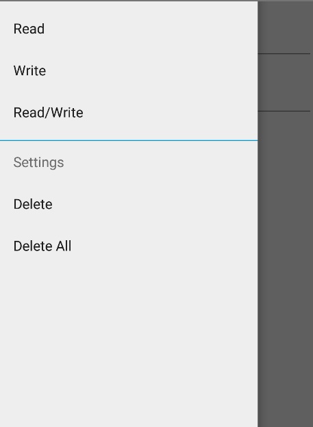
Change NavigationView divider color and sub header text color
For the separator you need to add style to your theme or NavigationView theme and change the value of android:attr/listDivider. Thats the background that divider is using.
Subheader is just a TextView. When you change the color of the divider you will see that it changes to the subheader. To change subheader text change the android:textColorPrimary and android:textColorSecondary in v21 value in your style too.
Change color of NavigationView's divider and deactive itemiconTint attributte
Yes you can deactive tint using
Programmatically
yourNavigationView.setItemIconTintList(null);
Using XML
<android.support.design.widget.NavigationView
    ...
    app:itemIconTint="@android:color/black"
    ... />
I hope it helps you ..
Navigation Drawer item divider with selected background color
I got it. It was a simple issue. I was just using the wrong state. So, here's the solution. I created two different layer lists (to add the divider to the navigation items):
nav_divider:
<?xml version="1.0" encoding="utf-8"?>
<layer-list xmlns:android="http://schemas.android.com/apk/res/android">
    <item android:left="@dimen/activity_horizontal_margin">
        <shape android:shape="rectangle">
            <solid android:color="@color/light_gray"/>
        </shape>
    </item>
    <item android:bottom="1dp">
        <shape android:shape="rectangle">
            <solid android:color="@color/white"/>
        </shape>
    </item>
</layer-list>
nav_divider_selected:
<?xml version="1.0" encoding="utf-8"?>
<layer-list xmlns:android="http://schemas.android.com/apk/res/android">
    <item android:left="@dimen/activity_horizontal_margin">
        <shape android:shape="rectangle">
            <solid android:color="@color/light_gray"/>
        </shape>
    </item>
    <item android:bottom="1dp">
        <shape android:shape="rectangle">
            <solid android:color="@color/light_blue"/>
        </shape>
    </item>
</layer-list>
Then, created a drawer_item_background drawable like this (state_checked should be used not state_selected):
<selector xmlns:android="http://schemas.android.com/apk/res/android">
        <item android:drawable="@drawable/nav_divider_selected" android:state_checked="true"/>
        <item android:drawable="@drawable/nav_divider"/>
</selector>
And, then I used this drawable as itemBackground in my NavigationView:
<com.google.android.material.navigation.NavigationView
    android:id="@+id/nav_view"
    android:layout_width="wrap_content"
    android:layout_height="match_parent"
    android:layout_gravity="right"
    android:fitsSystemWindows="true"
    android:background="@color/white"
    app:headerLayout="@layout/nav_header"
    app:menu="@menu/drawer_menu"
    app:itemTextColor="@color/drawer_item"
    app:itemIconTint="@color/drawer_item"
    app:itemBackground="@drawable/drawer_item_background"/>
WinUI: How to change NavigationView.Header background color?
Try to override the NavigationViewContentBackground theme resource:
<NavigationView Background="Gray">
    <NavigationView.Resources>
        <SolidColorBrush x:Key="NavigationViewContentBackground" Color="Red" />
    </NavigationView.Resources>
    <NavigationView.Header>
        <Border Background="Green">
            <TextBlock Text="Header"/>
        </Border>
    </NavigationView.Header>
    <Border Background="Orange">
        <TextBlock Text="Sweet content"/>
    </Border>
</NavigationView>
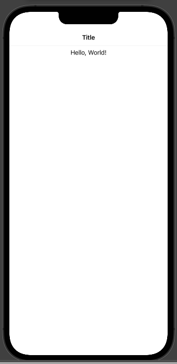
SwiftUI how to force a divider for navigation bar in NavigationView
I think you can work around by adding a manual Divider and ScrollView under VStack so that the divider will appear beneath the navigation bar
//
//  testUI.swift
//  DDStore (iOS)
//
//  Created by belal medhat on 19/02/2022.
//

import SwiftUI

struct navTitleBar: View {
    var body: some View {
        NavigationView {
            // main navigationView
            VStack(){
                // vstack to add the divider and under it the scrollview
                Divider()
                ScrollView(){
                    Text("Hello, World!")

                }.navigationBarTitleDisplayMode(.inline).navigationTitle("Title")
            }


        }


    }
}

struct testUI_Previews: PreviewProvider {
    static var previews: some View {
        navTitleBar()
    }
}
How to change background color of the NavigationView in SwiftUI?
First look at this result:
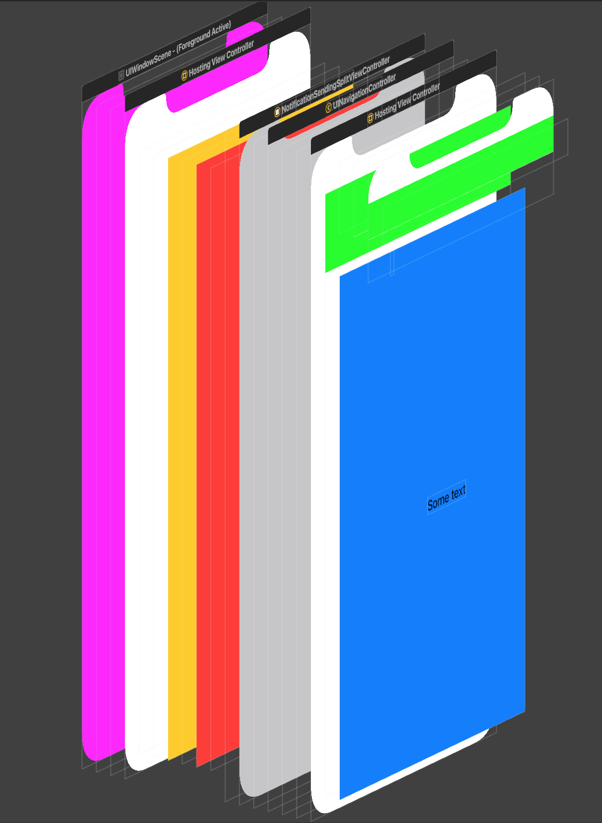
As you can see, you can set the color of each element in the View hierarchy like this:
struct ContentView: View {

    init(){
        UINavigationBar.appearance().backgroundColor = .green
        //For other NavigationBar changes, look here:(https://stackoverflow.com/a/57509555/5623035)
    }

    var body: some View {
        ZStack {
            Color.yellow
            NavigationView {
                ZStack {
                    Color.blue
                    Text("Some text")
                }
            }.background(Color.red)
        }
        // iOS 16 - No need for tweaking the appearance
        /* .toolbarBackground(.green, in: .navigationBar) */
    }
}
And the first one is window:
window.backgroundColor = .magenta
The issue you faced is we can not remove the background color of SwiftUI's HostingViewController (yet), so you can't see the navigationView (What you called) through the views hierarchy. You should wait for the API or try to fake the navigation view (not recommended).
Related Topics
Android Spannablestring Set Background Behind Part of Text
Resources$Notfoundexception: File Res/Drawable/Abc_Ic_Ab_Back_Material.Xml
Require a Password to Uninstall/Remove Application
How to Get the Selected Item from Listview
How to Get Current Buildtype in Android Gradle Configuration
Cannot Start Activity Background in Android 10 [ Android Q ]
How to Play an Mp3 in the Res/Raw Folder of My Android App
Material Design, Appcompat, and Backwards Compatibility
How to Modify Ripple Color When Using Attr/Selectableitembackground as Background
Converting Utc Dates to Other Timezones
How to Change the Background Color Around a Dialogfragment
How to Create Always-Top Fullscreen Overlay Activity in Android
Is Google's Android Opengl Tutorial Teaching Incorrect Linear Algebra
How to Find Intent Source in Android
How to Upload File Using Volley Library in Android
How to Correctly Start Activity from Postexecute in Android
Error Java.Lang.Runtimeexception: Stub! in Android with Fitnesse Testing