Application Skeleton to support multiple screens
Finally created a structure which handle layouts and icon for multiple screen.
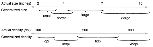
Android generalises device displays into categories based on two parameters:
- Screen size, the physical size of the display (measured diagonally)
- Screen density, the physical pixel density of the display (in pixels-per-inch, or ppi)`
To determine screen size & density quickly, please install "What's my Size" app for Android.
Screen size
Android defines four generalised screen sizes:
 Qualifier           Size

 small               ~3 inches (approx)
 normal              ~4 inches (approx)
 large               Exceeds 4 inches
 xlarge              Exceeds 7 inches
- Most phones are classified as small or normal (roughly 3 to 4 inches diagonally). But now, there are many phones with large screen such as Galaxy S4, HTC One, Xperia Z
- A small tablet like the Samsung Galaxy Tab is classified as large (larger than 4 inches)
- Extra-large applies to large devices, for example large tablets
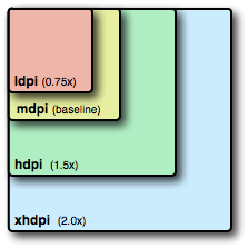
Android defines four generalised screen densities:
 Qualifier         Description         Nominal value

 ldpi              low density          120 ppi
 mdpi              medium density       160 ppi
 hdpi              high density         240 ppi
 xhdpi             extra high density   320 ppi
Typically:
- screen size has most impact on your app layouts
- screen density has most impact on your image and graphic resources
It is listed here the percentage difference of device screen
- Ldpi- 75%
- Mdpi- 100% (base according to Android developer site)
- Hdpi- 150%
- XHdpi- 200%
But as we know now most of device coming with 480X800 so I'm consider this as based device, so our new calculation will like this
- Ldpi- 50%
- Mdpi- 66.67%
- Hdpi- 100%
- XHdpi- 133.33%
which means that first icon and design will be created for 480X800 only and then for rest ones(i.e. Ldpi, Mdpi, Xhdpi).
There are images which are common for all layout and must uniform in color and shape(no complex shape, no curve) so for this kind of image we are creating 9patch which to be put in “drawable(no-suffix)” folder. To create 9Patch image you can either use DrawNinePatch or BetterNinePatch
Now just rename your images based on Android's standards and complete your application with hdpi and then just take drawable-hdpi folder and Open Adode Photoshop(recommended)
create Action of multiple size(just change the size according to percentage ratio) once Action created for all size then just do Batch Automate and give source(drawable-hdpi) and destination(drawable-ldpi, drawable-mdpi, drawable-xdpi).
The reason I insist you to use Photoshop because it will resize automatically your image with Actions and one more plus point is that you need not to rename the file(it will assign same name as original one).
once you completed with creation of all images, refresh your project and test it.
Sometimes there may be possibility that the layout which support screen(xhdpi, hdpi, mdpi) may be get cut in small screen(ldpi) so for handling this just create separate Layout folder(layout-small) for it and add ScrollView(mostly). Thats it.
Tablet
Tablets are categorized into two size.
- 7"(1024X(600-48(navigation bar))) = 1024X552 (drawable-large)
- 10"(1280X(800-48(navigation bar))) = 1280X752 (drawable-xlarge)
In this we need to create image for both the screen and just put them accordingly
So all in all we will have this folder in our application to support multiple screen.
drawable
drawable-ldpi
drawable-mdpi
drawable-hdpi
drawable-xhdpi
drawable-large
drawable-xlarge
will be more qualifier combination with Screen size and Screen density
drawable-large-ldpi
drawable-large-mdpi
drawable-large-hdpi
drawable-large-xhdpi
more qualifier with Screen density and Version
drawable-ldpi-v11
drawable-mdpi-v11
drawable-hdpi-v11
drawable-xhdpi-v11
and more qualifier with Screen size and Version
drawable-large-v11
drawable-xlarge-v11
and more qualifier with Smallest width concept(SW)
drawable-sw???dp
Further more in Android V3.0 Honeycomb they introduced new concept of SW(smallest width) in which device are categorized into screen width, so if we are creating a folder named drawable-sw360dp then the device with 720dp(either width or height) will use resource from the this folder.
for example to find the Samsung Galaxy S3 dp to suffix to drawable-sw?dp
With reference of DP Calculation, If you want to support your layout or drawable to S3 then the calculation says
px= Device's width = 720
dpi= Device's density= 320
formula given
px = dp * (dpi / 160)
interchanging formula because we have px's value
dp = px / (dpi / 160)
now putting value,
     dp= 720 / (320/160);
     dp=360.
so drawable-sw360dp will do the job
Get you Device configuaration from GsmArena
Sameway you can also create folder according to Device's Android API version i.e. drawable-hdpi-v11` so the device which is having API11 and it is Hdpi then it will use this resources.
Additional Tips:
Use relative layouts, dp, sp, and mm
dp units - device independent pixels normalised to 1 physical pixel on a 160 ppi screen i.e. medium density. Scaled at runtime. Use for screen element dimensions
sp units - scaled pixels, specified as floating point values, based on dp units but additionally scaled for the user's font-size preference setting. Scaled at runtime. Use for font sizes
you should always use RelativeLayout for layouts; AbsoluteLayout is deprecated and should not be used.
Use appropriate image formats - PNG versus JPEG
Android "prefers" PNG for bitmap image files, "accepts" JPEG, and "discourages" GIF.However, PNG and JPEG are not equivalents. They have different quality trade offs, and PNG is not always best:
JPEG can offer up to 50% file-size reductions over PNG, which is significant if your app is image-intensive
A higher quality "lossy" JPEG may look better than a highly compressed "lossless" PNG, for the same file size
Add labels to your images and graphics for debugging
Use the supports-screens element
Configure your emulators with real device values
Conventionally, desktop systems display at 72ppi (Mac), or 96ppi (Windows, Linux). Compared with mobile, desktop displays are always low density.
Always configure your Android emulators to mimic real device values, and always set them to scale to emulate device density.
In Eclipse, it's easy to create multiple emulators (from the Eclipse menu bar, select Window > AVD Manager > New) configured with values for real devices:
Name the emulator for the real device it's emulating
Specify Resolution, don't use Built-in generic sizes
Set the device density to match the real device (in the Hardware pane set Abstracted LCD Property to the real density, always an integer value)When you launch the device, always select Scale display to real size, and type in the real screen dimension in inches.
If you don't set the device density, the emulator defaults to low density, and always loads ldpi-specific resources. Resolution (pixel dimensions) will be correct, but your density-dependent image resources will not display as intended.
Of course, nothing you do will reproduce higher density image quality on a lower density desktop display.
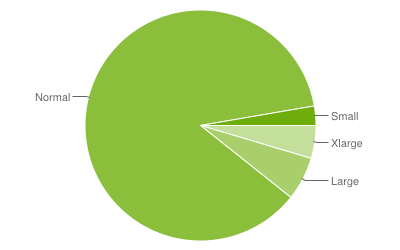
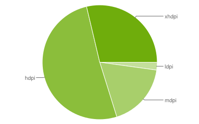
Here is the Data collected during a 7-day period ending on October 1, 2012. To see the latest statistic about Android platform version, go to here
Based on Screen Size
Based on Screen Density
How to make multiple screen support in android?
Official answer : http://developer.android.com/guide/practices/screens_support.html
Nothing to it.
layout for multiple screens
Your question is a complex one, but the short answer is that Android has different screen types and sizes, and therefore the determining factor on which resource gets used are:
- Localization
- Pixel Density of your device
Android looks at your Pixel density and determines which resource to use (if you specified any resources for large or small devices). But for this to work, you need to follow the localization and resource qualifier precedence. An example below:
Which Resource Takes Precedence?
I recommend you take a look at Localization , Alternative Resource and Different Screen Densities. If your folder qualifiers are not setup correctly, Android will ignore these resources and use the default one. Your resource folder should look something like this:
res/
  drawable        <- default
  drawable-ldpi   <- Alternative resources for low to large pixel densities
  drawable-mdpi
  drawable-hdpi
  drawable-xhdpi
  drawable-xxhdpi
  drawable-xxxhdpi
  values-sw600dp/
  values-fr/     <- Values for french resources
  layout/        <- Layout default
  layout-land/   <- Alternative layout for landscape orientation
You can also Google these if the Android Developer Guide is too vague for you. I hope this helps
Application to support multiple screen resolutions
When it comes to xlarge, large and small then it is depending on size(inches) not on dpi of your device
see below for specification
Additionally DPI is basically for Drawables while SIZE is for Layout.
How to have android application support multiple screen sizes with supports-screens
Ok, so what you have to know is that support-screens doesn't make your application look 'nice' on screens you are supporting (check this link). It just tells that users with such screens will be able to download your application, but it's up to you to make it display properly. You have to create layouts for specific screens on your own.
More about it you can read in Android's documentation: http://developer.android.com/guide/practices/screens_support.html
Basically, you have to properly name your directories in which layout files are stored in order to let Android know which one should it pick up for specific device. If for example your layout's file was "layout.xml" you should have:
/res/layout/layout.xml         // Default layout
/res/layout-small/layout.xml   // Small screens
/res/layout-large/layout.xml   // Large screens
/res/layout-xlarge/layout.xml  // Extra large screens
You can go even further and make also different layouts for portrait and landscape views by specyfing another keyword in directory's name:
/res/layout-small-land/layout.xml      // Small screens, landscape view
/res/layout-small-portrait/layout.xml  // Small screens, portrait view
Remember that tags order is important, so you can't write layout-portrait-small.
supporting multiple screens
Refer this documeation by android Supporting multiple screens
Adjusting text to support multiple screens
The issue has been solved by @Gabe Sechan (for anyone checking back), check the comments below the post!
Related Topics
How to Set the Part of the Text View Is Clickable
Get/Pick an Image from Android'S Built-In Gallery App Programmatically
Key Hash For Android-Facebook App
Best Practice For Storing and Protecting Private API Keys in Applications
Repeat a Task With a Time Delay
"R Cannot Be Resolved to a Variable"
How to Display an Alert Dialog on Android
Can the Android Layout Folder Contain Subfolders
Google Maps Android API V2 - Interactive Infowindow (Like in Original Android Google Maps)
Notification Not Showing in Oreo
Linear Layout and Weight in Android
Android Check Internet Connection
Communicating Between a Fragment and an Activity - Best Practices
Viewpager and Fragments - What's the Right Way to Store Fragment'S State
How to Hook into the Power Button in Android
Android Broadcastreceiver on Startup - Keep Running When Activity Is in Background