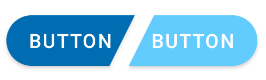
Android Custom Shape Button
Interesting question. I tried some solutions and this is what I found that has the same result of what you are trying to achieve. The solution below resolves 2 problems:
- Custom shape as you presented it
- The top right side of the button shouldn't be clickable
So this is the solution in 3 steps:
Step 1
Create two shapes.
First simple rectangle shape for the button: shape_button_beer.xml
<?xml version="1.0" encoding="utf-8"?>
<shape xmlns:android="http://schemas.android.com/apk/res/android" >

    <gradient
        android:angle="90"
        android:endColor="#C5D9F4"
        android:startColor="#DCE5FD" />

    <corners
        android:bottomLeftRadius="5dp"
        android:bottomRightRadius="5dp"
        android:topLeftRadius="5dp" >
    </corners>

</shape>
Second shape is used as mask for the top right side of the button: shape_button_beer_mask.xml. It is simple circle with black solid color.
<?xml version="1.0" encoding="utf-8"?>
<shape xmlns:android="http://schemas.android.com/apk/res/android"
    android:shape="oval" >

    <solid android:color="#000000" />

</shape>
Step 2
In your main layout add the button by next approach:
- RelativeLayout is the container of this custom button
- First LinearLayout is the blue button with beer icon and text inside
- Second ImageView is the mask above the blue button. And here comes dirty trick:
- Margins are negative to set the mask in the right place
- We define id to be able override on click (see step 3)
android:soundEffectsEnabled="false"- such that user will not feel that he pressed on something.
The XML:
    <!-- Custom Button -->
    <RelativeLayout
        android:layout_width="120dp"
        android:layout_height="80dp" >

        <LinearLayout
            android:id="@+id/custom_buttom"
            android:layout_width="100dp"
            android:layout_height="100dp"
            android:background="@drawable/shape_button_beer" >

            <!-- Beer icon and all other stuff -->

            <ImageView
                android:layout_width="40dp"
                android:layout_height="40dp"
                android:layout_marginLeft="5dp"
                android:layout_marginTop="15dp"
                android:src="@drawable/beer_icon" />
        </LinearLayout>

        <ImageView
            android:id="@+id/do_nothing"
            android:layout_width="120dp"
            android:layout_height="100dp"
            android:layout_alignParentRight="true"
            android:layout_alignParentTop="true"
            android:layout_marginRight="-50dp"
            android:layout_marginTop="-50dp"
            android:background="@drawable/shape_button_beer_mask"
            android:soundEffectsEnabled="false" >
        </ImageView>
    </RelativeLayout>
    <!-- End Custom Button -->
Step 3
In your main activity you define on click events for both: button and the mask as follow:
LinearLayout customButton = (LinearLayout) findViewById(R.id.custom_buttom);
customButton.setOnClickListener(new View.OnClickListener()
{
    @Override
    public void onClick(View arg0)
    {
        Toast.makeText(getApplicationContext(), "Clicked", Toast.LENGTH_SHORT).show();
    }
});

// Mask on click will do nothing
ImageView doNothing = (ImageView) findViewById(R.id.do_nothing);
doNothing.setOnClickListener(new View.OnClickListener()
{
    @Override
    public void onClick(View arg0)
    {
        // DO NOTHING
    }
});
That's it. I know that is not a perfect solution but in your described use case it could help.
I have tested it on my mobile and this is how it looks when you click on the blue area and nothing will happen on other areas:
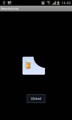
Hope it helped somehow :)
How to create a custom shape button background?
You can build a custom CornerTreatment with the MaterialButton.
You can extend the default CutCornerTreatment:
public class FullCutCornerTreatment extends CutCornerTreatment {

    protected static final float ANGLE_LEFT = 180;

    public FullCutCornerTreatment() {
        super();
    }

    @Override
    public void getCornerPath(
            @NonNull ShapePath shapePath, float angle, float interpolation, float radius) {
        shapePath.reset(0, 2*radius * interpolation, ANGLE_LEFT, 180 - angle);
        shapePath.lineTo(
                (float) (Math.sin(Math.toRadians(angle)) * radius * interpolation),
                (float) (Math.sin(Math.toRadians(90 - angle)) * radius * interpolation));
    }
}
Then just apply the CornerTreatment to the Button:
MaterialButton materialButton = findViewById(R.id....);
FullCutCornerTreatment customCutCornerTreatment = new FullCutCornerTreatment();

materialButton.setShapeAppearanceModel(materialButton.getShapeAppearanceModel().toBuilder()
        //Standard rounded corner with corner radius=50%
        .setTopLeftCorner(CornerFamily.ROUNDED,new RelativeCornerSize(0.5f))
        .setBottomLeftCorner(CornerFamily.ROUNDED,new RelativeCornerSize(0.5f))
        //Square angle
        .setTopRightCorner(CornerFamily.ROUNDED,0)
        //Full cut corner
        .setBottomRightCorner(customCutCornerTreatment)
             .setBottomRightCornerSize(new RelativeCornerSize(0.5f))
        .build());
Just a note about new RelativeCornerSize(0.5f): It changed in 1.2.0-beta01. Before it was new RelativeCornerSize(50)).
How make a custom shape button?
I found a solution, I create a polygon by points and by clicking on it when checking. whether the coordinate is in a polygon
public class CustomFormView extends View {

private ArrayList<Point> points;
public Paint paint;

public CustomFormView(Context context, ArrayList<Point> points) {
    super(context);
    paint = new Paint();

    this.points = points;
}

@Override
protected void onDraw(Canvas canvas) {
    //paint.setColor(Color.TRANSPARENT);
    paint.setStyle(Paint.Style.STROKE);

    Path path = new Path();
    path.moveTo(points.get(0).x, points.get(0).y);
    for (int i = 1; i < points.size(); i++) {
        path.lineTo(points.get(i).x, points.get(i).y);
    }
    path.close();

    canvas.drawPath(path, paint);
}

@Override
public boolean onTouchEvent(MotionEvent event) {
    if (event.getAction() == MotionEvent.ACTION_DOWN) {
        if (!contains(new Point(event.getX(), event.getY()))) {
            return false;
        }
    }
    return super.onTouchEvent(event);
}

public boolean contains(Point test) {
    int i;
    int j;
    boolean result = false;
    for (i = 0, j = points.size() - 1; i < points.size(); j = i++) {
        if ((points.get(i).y > test.y) != (points.get(j).y > test.y) &&
                (test.x < (points.get(j).x - points.get(i).x) * (test.y - points.get(i).y) / (points.get(j).y - points.get(i).y) + points.get(i).x)) {
            result = !result;
        }
    }
    return result;
}
}
Custom shape design for button in android
Design the shape whatever you want in any designing tool, export it as SVG. Then, in android studio right click on "drawable" folder -> new vector asset, then choose the exported SVG file from your local disc.
Now you can able to set the created drawable as button background.
Custom shaped Buttons
What you're looking for is the Shape Drawable. Basically, in Android the easiest way to create custom shapes is by creating a Shape drawable and defining its shape in the drawable's XML.
Drawables are better than other image forms such as .PNG - specially for your use case. If you're new to custom shapes and drawables, I'd recommend you to read up more on them and their advantages.
Also, take a look at this question for a working example.
You'd find a number of similar examples all over SO and other websites. You might just also find a shape drawable that matches the exact pattern that you're looking for.
Android Studio custom button color is not changing while shape is changing
I figured out that when using the custom button make sure to change the
<Button.../>
to
<androidx.appcompat.widget.AppCompatButton
It's due to material io buttons can't accept custom buttons as background.
Related Topics
How to Add Window -- Token Android.Os.Binderproxy Is Not Valid; Is Your Activity Running
Error Strictmode$Androidblockguardpolicy.Onnetwork
How to Create a Custom Notification Layout in Android
Bypass Android Usb Host Permission Confirmation Dialog
Android Studio: How to Attach Android Sdk Sources
How to Keep My Android Service Running When the Screen Is Turned Off
Android: Set Color of Checkbox
Error:Execution Failed For Task ':App:Transformclasseswithjarmergingfordebug'
Webview Link Click Open Default Browser
Host-Based Card Emulation with Fixed Card Id
Current Month Facebook Friends Birthdays in Android
Android: Share Plain Text Using Intent (To All Messaging Apps)
Show Download Progress Inside Activity Using Downloadmanager