Android: Create a toggle button with image and no text
Can I replace the toggle text with an image
No, we can not, although we can hide the text by overiding the default style of the toggle button, but still that won't give us a toggle button you want as we can't replace the text with an image.
How can I make a normal toggle button
Create a file ic_toggle in your
res/drawablefolder<selector xmlns:android="http://schemas.android.com/apk/res/android">
<item android:state_checked="false"
android:drawable="@drawable/ic_slide_switch_off" />
<item android:state_checked="true"
android:drawable="@drawable/ic_slide_switch_on" />
</selector>Here
@drawable/ic_slide_switch_on&@drawable/ic_slide_switch_offare images you create.Then create another file in the same folder, name it ic_toggle_bg
<?xml version="1.0" encoding="utf-8"?>
<layer-list xmlns:android="http://schemas.android.com/apk/res/android">

    <item android:id="@+android:id/background"
          android:drawable="@android:color/transparent" />

    <item android:id="@+android:id/toggle"
          android:drawable="@drawable/ic_toggle" />

</layer-list>
Now add to your custom theme, (if you do not have one create a styles.xml file in your
res/values/folder)<style name="Widget.Button.Toggle" parent="android:Widget">
<item name="android:background">@drawable/ic_toggle_bg</item>
<item name="android:disabledAlpha">?android:attr/disabledAlpha</item>
</style>
<style name="toggleButton" parent="@android:Theme.Black">
<item name="android:buttonStyleToggle">@style/Widget.Button.Toggle</item>
<item name="android:textOn"></item>
<item name="android:textOff"></item>
</style>This creates a custom toggle button for you.
How to use it
Use the custom style and background in your view.
  <ToggleButton
        android:id="@+id/toggleButton"
        android:layout_width="wrap_content"
        android:layout_height="match_parent"
        android:layout_gravity="right"
        style="@style/toggleButton"
        android:background="@drawable/ic_toggle_bg"/>
How to create toggle button with icon and text
You can use a MaterialButton with android:checkable="true":
   <com.google.android.material.button.MaterialButton
        android:checkable="true"
        app:backgroundTint="@drawable/btn_toggle_background"
        app:iconGravity="start"
        app:icon="@drawable/..."
        app:cornerRadius="20dp"
        ../>
where btn_toggle_background is a selector
<selector xmlns:android="http://schemas.android.com/apk/res/android">
    <item android:state_checked="false" android:color="@color/..." />
    <item android:state_checked="true" android:color="@color/..." />
</selector>
with:
    button.addOnCheckedChangeListener { button, isChecked ->
        if (isChecked){
            button.icon = ContextCompat.getDrawable(this,R.drawable.xxx)
        } else {
            button.icon = ContextCompat.getDrawable(this,R.drawable.xxx)
        }
    }


Centering ToggleButton Image - With No Text
I revised the answer to answer your revised question.
The drawableLeft, drawableRight, and drawableTop button, as far as I can tell, control where the image is placed relative to the selector (a/k/a on/off) indicator. Top will place it above the indicator with left and right placing it to a specific side respectively. I do not believe you can remove the selector indicator as that would defeat the purpose of using a ToggleButton.
I was able to center 2 drawable in 2 ToggleButtons using the following layout. To center the images within the ToggleButton I used drawableTop so that the images appeared over the selection indicator. I then set both textOn and textOff to be an empty string. If you do not set this, then the default on/off text appears above the selector indicator and pushes the drawable to the side.
<LinearLayout
    android:id="@+id/buttonContainer"
    android:layout_width="match_parent"
    android:layout_height="wrap_content"
    android:gravity="center"
    android:orientation="horizontal">

   <ToggleButton
    android:id="@+id/bSmenuTopItems"
        android:layout_width="0"
        android:layout_weight="1"
        android:layout_height="75dp"
        android:checked="false"
        android:drawableTop="@drawable/flag"
        android:textOn=""
        android:textOff=""
        android:layout_gravity="center"
        android:textColor="#cecece" />

    <ToggleButton
        android:id="@+id/bSmenuTopItems2"
        android:layout_width="0"
        android:layout_height="75dp"
        android:layout_weight="1"
        android:checked="false"
        android:textOn=""
        android:textOff=""
        android:drawableTop="@drawable/chaticon"
        android:layout_gravity="center"
        android:textColor="#cecece" />

</LinearLayout>
All you should have to do is adjust the height of the button to position your icon relative to the selector icon where you want it. My only other suggestion would be to control the size of the image you are using. If you can just adjust the dimensions of the image relative to the button, placing it with drawableTop should center it automatically.
Android Set ImageButton as Toggle
There are a few ways of doing this:
First, you can simply use an ImageButton, and manually toggle its image drawable on click in Java. This is what the stock Music player on Android does for the shuffle button, for example. Although you won't have control over the button background in its checked state, you'll be able to swap out the image, which may be favorable from an Android UI-consistency perspective.
Another option is to use a complex set of drawables and nine-patches to get an image inside a ToggleButton, with the option of changing the background and/or the image resource upon toggle. That's the option I'll show below. But remember, be cautious about UI consistency before doing this.
res/layout/foo.xml
...
<ToggleButton
    android:textOn="" android:textOff=""
    android:layout_width="wrap_content"
    android:layout_height="wrap_content"
    android:background="@drawable/shuffle_button" />
...
res/drawable/shuffle_button.xml
<layer-list xmlns:android="http://schemas.android.com/apk/res/android">
    <!-- use "@android:drawable/btn_default" to keep consistent with system -->
    <item android:drawable="@drawable/toggle_button_background" />
    <item android:drawable="@drawable/shuffle_button_image" />
</layer-list>
res/drawable/toggle_button_background.xml
<selector xmlns:android="http://schemas.android.com/apk/res/android">
    <!-- checked state -->
    <item android:state_pressed="false" android:state_checked="true"
          android:drawable="@drawable/btn_default_checked" />

    <item android:state_window_focused="false" android:state_enabled="true"
          android:drawable="@drawable/btn_default_normal" />
    <item android:state_window_focused="false" android:state_enabled="false"
          android:drawable="@drawable/btn_default_normal_disable" />
    <item android:state_pressed="true"
          android:drawable="@drawable/btn_default_pressed" />
    <item android:state_focused="true" android:state_enabled="true"
          android:drawable="@drawable/btn_default_selected" />
    <item android:state_enabled="true"
          android:drawable="@drawable/btn_default_normal" />
    <item android:state_focused="true"
          android:drawable="@drawable/btn_default_normal_disable_focused" />
    <item android:drawable="@drawable/btn_default_normal_disable" />
</selector>
res/drawable/shuffle_button_image.xml
<selector xmlns:android="http://schemas.android.com/apk/res/android">
    <item android:drawable="@drawable/ic_mp_shuffle_on_btn" android:state_checked="true" />
    <item android:drawable="@drawable/ic_mp_shuffle_off_btn" />
</selector>
Image files
btn_default_<state>.9.pngcan be found inframeworks/base.git
undercore/res/res/drawable-hdpi
andcore/res/res/drawable-mdpi(also ldpi).
WARNING: if you use these, your app will look inconsistent on devices with customized OS UIs (i.e. HTC's Sense UI).
ic_mp_shuffle_<state>_btn.9.pngneed to be nine-patches, so that the image gets centered and not stretched to fit the button. Below are examplehdpiversions of the icon:
res/drawable-(h|m|ldpi)/ic_mp_shuffle_(on|off)_btn.9.png
Final Note: Remember to be consistent with the system UI when possible, and be mindful of the fact that your app may run on devices with customized versions of the OS that have different graphics for UI elements like buttons. An example of this is HTC Sense, which has green buttons in place of the grey/orange/yellow ones in stock Android. So, if you end up copying the btn_default_... PNG files from the open source repository to create a toggle-able button background, you'll break consistency on those devices.
Toggle button using two image on different state
Do this:
<ToggleButton
        android:id="@+id/toggle"
        android:layout_width="wrap_content"
        android:layout_height="wrap_content"
        android:background="@drawable/check"   <!--check.xml-->
        android:layout_margin="10dp"
        android:textOn=""
        android:textOff=""
        android:focusable="false"
        android:focusableInTouchMode="false"
        android:layout_centerVertical="true"/>
create check.xml in drawable folder
<?xml version="1.0" encoding="utf-8"?>
<selector xmlns:android="http://schemas.android.com/apk/res/android">
    <!-- When selected, use grey -->
    <item android:drawable="@drawable/selected_image"
          android:state_checked="true" />
    <!-- When not selected, use white-->
    <item android:drawable="@drawable/unselected_image"
        android:state_checked="false"/>

 </selector>
Change toggle button image onclick
Delete both btnFav.setChecked(true) and btnFav.setChecked(false) in your OnClick method. It is a togglebutton which toggles the setChecked on its own by every click and you reset it to the old value. So in your case it always has the same value(the start value).
I would suggest you rather use setOnCheckedChangeListener instead of onClickListener.
How to move the image inside the toggle button next to the text?
Please check this (Updated):
<ToggleButton
    android:id="@+id/unit"
    android:layout_width="wrap_content"
    android:layout_height="wrap_content"
    android:background="?android:selectableItemBackground"
    android:textOff="kg"
    android:textOn="lbs"
    android:paddingLeft="20dp"
    android:drawableStart="@drawable/ic_add_routine"
    android:drawableLeft="@drawable/ic_add_routine"
    android:gravity="left|center_vertical"/>
Output: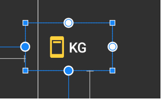
It is possible to create a ToggleButton without text?
The empty space in the top is caused by the 2 Ninepatch (btn_toggle_off.9.png and btn_toggle_on.9.png ) used in default toggleButton style.
To perfectly center the horizontal bar, you must create a new style for ToggleButton that will use two new ninepatch derived form original.
Edit:
Method requiring minimal XML:
create your two ninepatches for your togglebutton, name it:
my_btn_toggle_on andmy_btn_toggle_offin drawable folder, create
my_btn_toggle.xml:<selector xmlns:android="http://schemas.android.com/apk/res/android">
<item android:state_checked="false" android:drawable="@drawable/my_btn_toggle_off" />
<item android:state_checked="true" android:drawable="@drawable/my_btn_toggle_on" />
</selector>in your code, add
tb.setBackgroundResource(R.drawable.my_btn_toggle):ToggleButton tb = new ToggleButton(map);
tb.setText(null);
tb.setTextOn(null);
tb.setTextOff(null);
tb.setBackgroundResource(R.drawable.my_btn_toggle)
Related Topics
How to Add Network_Security_Config.Xml to Manifest in Expo App Without Ejecting
Equivalent of Listview.Setemptyview in Recyclerview
Cordova "Hello World" App Won't Display
Android Studio - Cannot Resolve Symbol 'Firebase'
Fragment's Onsaveinstancestate() Is Never Called
How to Create a Looper Thread, Then Send It a Message Immediately
Change Background Popupmenu in Android
Android-Textview Settext in HTML.Fromhtml to Display Image and Text
Input Field Hidden When Soft Keyboard Appears in Phonegap
Android M Write to Sd Card - Permission Denied
Extract Notification Text from Parcelable, Contentview or Contentintent
When Do I Use Setstate in Flutter
Recyclerview with Multiple Countdown Timers Causes Flickering
Save Webview Content to Android Storage and Load It
How to Make My Layout Able to Scroll Down