Adding custom radio buttons in android
Add a background drawable that references to an image, or a selector (like below), and make the button transparent:
<RadioButton
    android:id="@+id/radio0"
    android:layout_width="wrap_content"
    android:layout_height="wrap_content"
    android:background="@null"
    android:button="@drawable/yourbuttonbackground"
    android:checked="true"
    android:text="RadioButton1" />
If you would like your radio buttons to have a different resource when checked, create a selector background drawable:
res/drawable/yourbuttonbackground.xml
<selector xmlns:android="http://schemas.android.com/apk/res/android" >
    <item
        android:drawable="@drawable/b"
        android:state_checked="true"
        android:state_pressed="true" />
    <item
        android:drawable="@drawable/a"
        android:state_pressed="true" />
    <item
        android:drawable="@drawable/a"
        android:state_checked="true" />
    <item
        android:drawable="@drawable/b" />
</selector>
In the selector above, we reference two drawables, a and b, here's how we create them:
res/drawable/a.xml - Selected State
<shape
    xmlns:android="http://schemas.android.com/apk/res/android"
    android:shape="rectangle" >
    <corners
        android:radius="5dp" />
    <solid
        android:color="#fff" />
    <stroke
        android:width="2dp"
        android:color="#53aade" />
</shape>
res/drawable/b.xml - Regular State
<shape
    xmlns:android="http://schemas.android.com/apk/res/android"
    android:shape="rectangle" >
    <corners
        android:radius="5dp" />
    <solid
        android:color="#fff" />
    <stroke
        android:width="2dp"
        android:color="#555555" />
</shape>
More on drawables here: http://developer.android.com/guide/topics/resources/drawable-resource.html
How to use a custom layout as RadioButton label
There are two ways to do the job:
1. When we hear about a custom view, it drives us to override onDraw method then drawing what we want into the view's Canvas.
2. In this case, there is a simpler approach, using drawableLeft. Here I've extended AppCompatRadioButton and set the considered layout as the drawableLeft.
MyRadioButton.java
package com.aminography.radiobutton;

import android.content.Context;
import android.graphics.Bitmap;
import android.graphics.drawable.BitmapDrawable;
import android.util.AttributeSet;
import android.view.LayoutInflater;
import android.view.View;
import android.widget.ImageView;
import android.widget.TextView;

import com.bumptech.glide.Glide;
import com.bumptech.glide.load.DataSource;
import com.bumptech.glide.load.MultiTransformation;
import com.bumptech.glide.load.engine.GlideException;
import com.bumptech.glide.load.resource.bitmap.CenterCrop;
import com.bumptech.glide.request.RequestListener;
import com.bumptech.glide.request.RequestOptions;
import com.bumptech.glide.request.target.Target;

import jp.wasabeef.glide.transformations.MaskTransformation;

// TODO: If you are using androidx
import androidx.annotation.Nullable;
import androidx.appcompat.widget.AppCompatRadioButton;

// TODO: If you are using appcompat
//import android.support.annotation.Nullable;
//import android.support.v7.widget.AppCompatRadioButton;

public class MyRadioButton extends AppCompatRadioButton {

    private View view;
    private TextView textView;
    private ImageView imageView;

    public MyRadioButton(Context context) {
        super(context);
        init(context);
    }

    public MyRadioButton(Context context, AttributeSet attrs) {
        super(context, attrs);
        init(context);
    }

    public MyRadioButton(Context context, AttributeSet attrs, int defStyleAttr) {
        super(context, attrs, defStyleAttr);
        init(context);
    }

   private RequestListener<Bitmap> requestListener = new RequestListener<Bitmap>() {
        @Override
        public boolean onLoadFailed(@Nullable GlideException e, Object model, Target<Bitmap> target, boolean isFirstResource) {
            return false;
        }

        @Override
        public boolean onResourceReady(Bitmap resource, Object model, Target<Bitmap> target, DataSource dataSource, boolean isFirstResource) {
            imageView.setImageBitmap(resource);
            redrawLayout();
            return false;
        }
    };

    public void setImageResource(int resId) {
        Glide.with(getContext())
                .asBitmap()
                .load(resId)
                .apply(RequestOptions.bitmapTransform(
                        new MultiTransformation<>(
                                new CenterCrop(),
                                new RoundedCornersTransformation(dp2px(getContext(), 24), 0, RoundedCornersTransformation.CornerType.ALL))
                        )
                )
                .listener(requestListener)
                .submit();
    }

    public void setImageBitmap(Bitmap bitmap) {
        Glide.with(getContext())
                .asBitmap()
                .load(bitmap)
                .apply(RequestOptions.bitmapTransform(
                        new MultiTransformation<>(
                                new CenterCrop(),
                                new RoundedCornersTransformation(dp2px(getContext(), 24), 0, RoundedCornersTransformation.CornerType.ALL))
                        )
                )
                .listener(requestListener)
                .submit();
    }

    // setText is a final method in ancestor, so we must take another name.
    public void setTextWith(int resId) {
        textView.setText(resId);
        redrawLayout();
    }

    public void setTextWith(CharSequence text) {
        textView.setText(text);
        redrawLayout();
    }

    private void init(Context context) {
        view = LayoutInflater.from(context).inflate(R.layout.my_radio_button_content, null);
        textView = view.findViewById(R.id.textView);
        imageView = view.findViewById(R.id.imageView);
        redrawLayout();
    }

    private void redrawLayout() {
        view.setDrawingCacheEnabled(true);
        view.measure(View.MeasureSpec.UNSPECIFIED, View.MeasureSpec.UNSPECIFIED);
        view.layout(0, 0, view.getMeasuredWidth(), view.getMeasuredHeight());

        view.buildDrawingCache(true);
        Bitmap bitmap = Bitmap.createBitmap(view.getDrawingCache());
        setCompoundDrawablesWithIntrinsicBounds(new BitmapDrawable(getResources(), bitmap), null, null, null);
        view.setDrawingCacheEnabled(false);
    }

    private int dp2px(Context context, int dp) {
        return (int) (dp * context.getResources().getDisplayMetrics().density);
    }

}
my_radio_button_content.xml
<?xml version="1.0" encoding="utf-8"?>
<LinearLayout xmlns:android="http://schemas.android.com/apk/res/android"
android:layout_width="wrap_content"
android:layout_height="wrap_content"
android:gravity="center_horizontal"
android:orientation="vertical">
<TextView
android:id="@+id/textView"
android:layout_width="wrap_content"
android:layout_height="wrap_content"
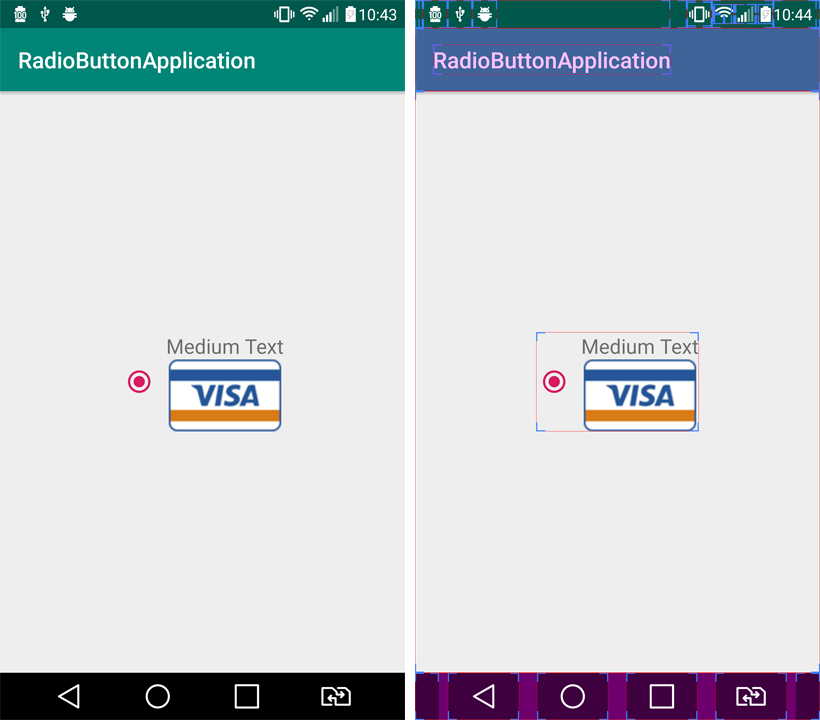
android:text="Medium Text"
android:textAppearance="?android:attr/textAppearanceMedium" />
<ImageView
android:id="@+id/imageView"
android:layout_width="96dp"
android:layout_height="64dp"
android:src="@drawable/img_visa" />
</LinearLayout>
Visual Result:
Note:
1. If you're using appcompat in the project, do comment the androidx import at the top of class and uncomment appcompat one.
2. You can change the position of the custom layout simply by changing android:paddingLeft for your RadioButton:
<com.aminography.radiobutton.MyRadioButton
    android:id="@+id/radioButton"
    android:layout_width="wrap_content"
    android:layout_height="wrap_content"
    android:paddingLeft="8dp" />
Edited:
I've rewritten the code to address the requirement of rounded corners image using Glide and Glide-Transformations.
build.gradle
dependencies {
    implementation 'com.github.bumptech.glide:glide:4.9.0'
    implementation 'jp.wasabeef:glide-transformations:3.3.0'
}
Android custom radiobutton
This is about as close as I can get you, hope it works on your side and that it helps :)
radio_normal:
<?xml version="1.0" encoding="utf-8"?>
<shape xmlns:android="http://schemas.android.com/apk/res/android"
    android:shape="ring"
    android:useLevel="false">
    <solid android:color="#2196f3" />
    <size
        android:width="25dp"
        android:height="25dp" />
</shape>
radio_pressed:
<?xml version="1.0" encoding="utf-8"?>
<layer-list xmlns:android="http://schemas.android.com/apk/res/android" android:padding="3dp">
    <item>
        <shape xmlns:android="http://schemas.android.com/apk/res/android"
            android:shape="ring"
            android:useLevel="false">
            <solid android:color="@android:color/white" />
            <size
                android:width="25dp"
                android:height="25dp" />
        </shape>
    </item>
    <item
        android:bottom="7dp"
        android:left="7dp"
        android:right="7dp"
        android:top="7dp">
        <shape
            android:shape="oval"
            android:useLevel="false">

            <solid android:color="@android:color/white" />
        </shape>
    </item>
</layer-list>
radio_bg:
<?xml version="1.0" encoding="utf-8"?>
<selector xmlns:android="http://schemas.android.com/apk/res/android">
    <item
        android:state_checked="true"
        android:drawable="@drawable/radio_pressed"
        >
    </item>
    <item
        android:state_checked="false"
        android:drawable="@drawable/radio_normal"
        >
    </item>
</selector>
activity_main:
<RadioButton
    android:id="@+id/radio"
    android:layout_width="match_parent"
    android:layout_height="wrap_content"
    android:layout_marginTop="100dp"
    android:button="@drawable/radio_bg"/>
Let me know if this worked for you :)
android - styling checkbox and radiobutton
Use <item name="colorControlNormal"> <item name="colorControlActivated"> for change color of checkbox
How to customize default theme of radio button in android?
Finally, i found answer by myself
I just create custom layout and add to ListAdapter object
radiobuttonlayout.xml
<?xml version="1.0" encoding="utf-8"?>
<CheckedTextView xmlns:android="http://schemas.android.com/apk/res/android"
android:id="@+id/checkedTextView"
android:layout_width="match_parent"
android:layout_height="wrap_content"
android:checkMark="@drawable/radiobutton_drawable"
android:gravity="center_vertical"
android:text="New CheckedTextView"
android:padding="@dimen/dp10"
android:textColor="@color/white" />
Java file code
ListAdapter listAdapter = new ArrayAdapter<String>    (context,R.layout.radiobuttonlayout,aryStrLockscreens);
    listview_lockscreen.setAdapter(listAdapter);
It's worked for me.
Change the circle color of radio button
It is simpler just setting the buttonTint color (only works on API level 21 or above):
<RadioButton
    android:layout_width="wrap_content"
    android:layout_height="wrap_content"
    android:id="@+id/radio"
    android:checked="true"
    android:buttonTint="@color/your_color"/>
In your values/colors.xml file, put your color, in this case a reddish one:
<color name="your_color">#e75748</color>
Result:

If you want to do it by code (also API 21 and above):
if(Build.VERSION.SDK_INT >= 21)
{
    ColorStateList colorStateList = new ColorStateList(
            new int[][]
            {
                new int[]{-android.R.attr.state_enabled}, // Disabled
                new int[]{android.R.attr.state_enabled}   // Enabled
            },
            new int[]
            {
                Color.BLACK, // disabled
                Color.BLUE   // enabled
            }
        );

    radio.setButtonTintList(colorStateList); // set the color tint list
    radio.invalidate(); // Could not be necessary
}
Android. How to customize radio button
Try adding the following attributes into the RadioButton, it should work.
android:layoutDirection="rtl"
android:textAlignment="textStart"
android:layout_gravity="start"
Remember to set supportsRtl property to true in your application manifest.
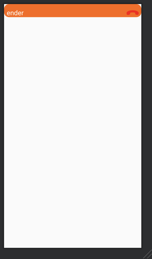
<RadioGroup
    android:layout_width="match_parent"
    android:layout_height="wrap_content">

    <RadioButton
        android:layout_width="match_parent"
        android:layout_height="wrap_content"
        android:layout_marginStart="8dp"
        android:layout_marginTop="12dp"
        android:layout_marginEnd="8dp"
        android:layoutDirection="rtl"
        android:textAlignment="textStart"
        android:layout_gravity="start"
        android:button="@drawable/ic_icon_phone_red"
        android:text="ender"
        android:textColorLink="@color/white"
        android:textColor="@color/white"
        android:textSize="20sp" />
</RadioGroup>
Related Topics
How to Add a Button Dynamically in Android
Clicking Urls Opens Default Browser
Open Application After Clicking on Notification
Error:Execution Failed for Task ':App:Transformclasseswithdexfordebug'
Overriding the Home Button - How to Get Rid of the Choice
Execution Failed App:Processdebugresources Android Studio
Simplecursortreeadapter and Cursorloader for Expandablelistview
How to Specify Different Layouts for Portrait and Landscape Orientations
How to Draw Interactive Polyline on Route Google Maps V2 Android
Eclipse Giving Error, Missing R.Java File After Recent Update
Java.Lang.Runtimeexception: Unable to Instantiate Activity Componentinfo
How to Make a Phone Call Using Intent in Android
How to Layout Text to Flow Around an Image
How to Pass Arraylist<Customeobject> from One Activity to Another
List Filter Custom Adapter Dont Give Result